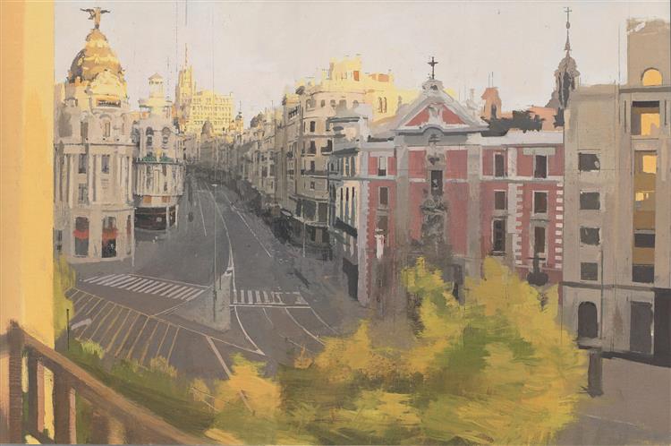
Matthias Jung

Name of work:Land of Evening
Name of artist:Matthias Jung
Year of work:2015

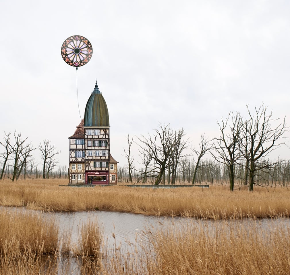
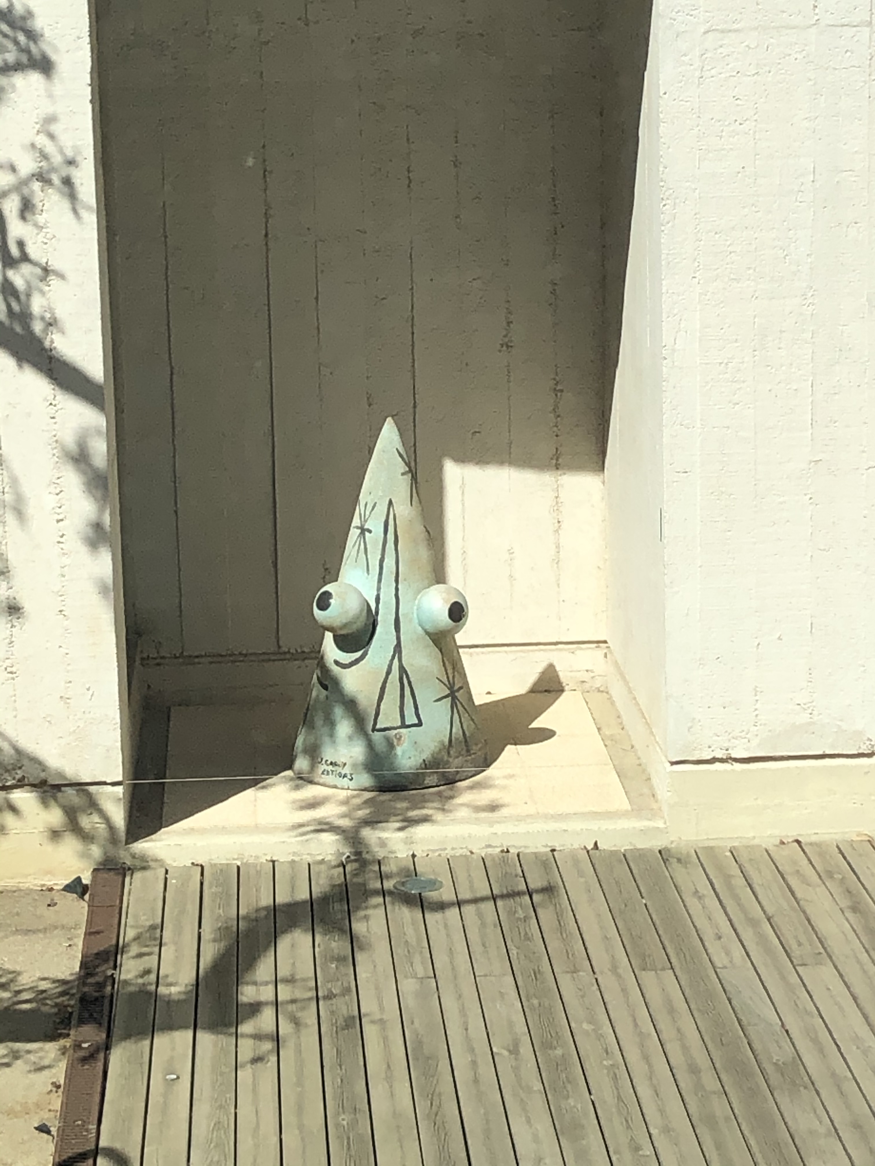
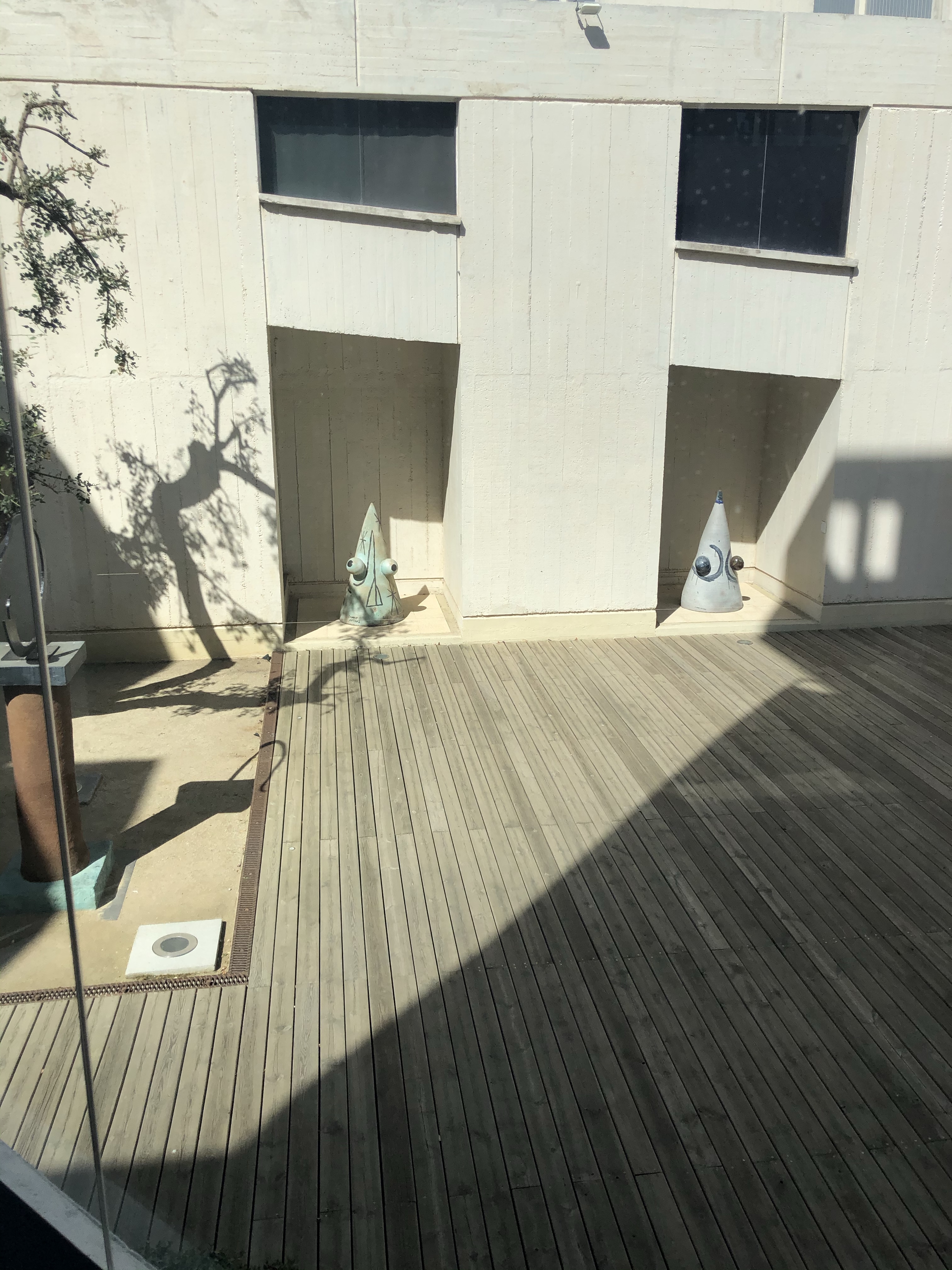
Content- The subject matter of this work is surrealism. It is a dream-like landscape of a fantasy house and a big balloon stranded in a marshland field. It has no message behind it, it is just a piece of artwork. It was imagined so it is not real and does not exist. It shows surrealism especially in the balloon as it is quite unrealistic.

Form– This is a landscape image so this is how it has been arranged, in a setting with grass and trees. The house has been placed slightly off centred to the left where there is a gap in the trees. There is quite a dull and dirty colour scheme for the landscape background but a lot more brighter colours for the house and balloon which makes it the focus point as it stands out against the contrasted background. A lot of browns and very faded blues that look grey have been used for the landscape makes me describe the scene as quite ‘dead’, especially as the grass is brown and the trees are too, with no leaves or flowers at all. The main shape in the artwork is the house and balloon which is bold and since it has come from another image, is brighter and dominates the image. It actually makes the dull landscape more pleasant and pretty.

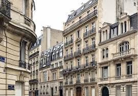
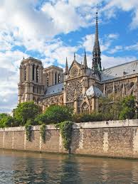
Process– The artwork is an architectural collage. Jung often makes architecture out of lots of other buildings chopped and finely put together as a collage. The background of this image is a photograph of a swamp area in Germany near the border of Poland. Jung then used other photographs of homes and cottages to make the building in the picture. The balloon in the image is from a photograph of a Gothic church he took in the small French city of Wissembourg. He had made this image using Photoshop. He used to just use scissors and glue as a child. He would have commenced his work in his studio at home and it would have been done in one day or two, and not over a period of time.

Mood– The artwork does not really affect me in anyway or capture a mood or feeling. It convoys feelings about life and nature I think because of the architecture against the natural scenic landscapes. I think apart from composition, the artist was just thinking about the collaged building while he was making this piece of work and paying attention to the shape and size and especially the colours and how it pieced together as one building. I really like how he added a balloon at the end too as an addition; It’s unusual and relates very much to the dreamy idea. I cannot describe the mood of the artwork very well, I can imagine it being very natural in sound, like the sounds of wind, and water trickling, and the grass blowing. But no birds or life. The house contrasts the setting very much so it is hard to describe an overall feeling. The house and the surrealist idea makes the artwork seem a bit like a dream, because it is half real yet half imaginary. The work sets an in the moment mood and has not directly affected me.

Ideas Generation 2

For further ideas generating, I made a list of all the themes that we are supposed to choose from and wrote the description of them next to it, and then I started thinking about things I can do in that theme.

I decided I am going to settle with the Urban theme where I can explore global cities like Barcelona and it is linked with multiculturalism. I am excited to exceed in this project.

This is my final plan that will get me going with the project theme.

Cities around the World

The top most visited cities in the world:

  • Paris, France
  • Dubai, UAE
  • New York, USA
  • Singapore
  • Kuala Lumpur, Malaysia
  • Instanbul, Turkey
  • Tokyo, Japan
  • Seoul, South Korea

Top most cultural cities around the world:

  • Amsterdam, Netherlands
  • Dublin, Ireland
  • Praque, Czech Republic
  • Miami, Florida, USA
  • Paris, France
  • Barcelona, Spain
  • Milan, Italy
  • Rome, Italy

Shanghai in China is a very cultural city. China’s largest city and in fact the city with the highest population in the world. It is mainly known as the global financial hub as it serves as the most influential economic, financial, international trade, and cultural centre in East China. Its technology overtakes New York and anywhere else as it is constantly changing and upgrading in technology every day. Also, all year round, the city is full of cultural attractions such as national and regional museums, inspiring art galleries, erratic restaurants and cafes, vibrant nightlife, and of course, a diverse architecture.

One of its most famous buildings is the Oriental Pearl Tower which is easily picked out due to its unique design with huge pink spears and very tall spire. Other main attractions include Shanghai Museum, The Bund, Yu Garden and Shanghai World Financial Centre. It also has the world’s fastest train ‘the Maglev’.

Paris in France is a city overloaded with European culture. It is actually the most romantic city in the world and has a true French mood by the small streets with iconic restaurants and blissful bakeries. Paris has many beautiful collections for modern art, fashion, cinemas, film festivals, shopping and gastronomy. The city is built up of the traditional streets with wondrous architecture ranging from The Louvre to the Eiffel Tower, new and old.

Amsterdam, capital of the Netherlands, is very known for its artistic heritage, narrow houses with gabled facades and being home of the Van Gogh museum. It is popular amongst art students because of these reasons and its large amount of beautiful art galleries and museums. With that aside, it is extremely popular for cycling, and grassy parks and is also well-known for it’s canal system; the canal that runs through the city with lots of colourful boats going up and down it everyday.

Amsterdam is very cultural. The main attractions are: Rijksmuseum, Anne Frank House, Van Gogh Museum, Jordaan, Royal Palace of Amsterdam, Dam Square and more. The building’s are mostly old and traditional which means they’re more cultural. Also, the buildings and houses, especially along the river, are very erotic because they are all different shapes and sizes, colours and heights, all decorated individually. They look very stunning yet so wacky, its almost like a street from a cartoon or illustration.

The multicoloured houses and buildings along the canal with boats along it.
The Royal Palace of Amsterdam.

Istanbul is the capital of Turkey and is a very cultural and religious, empire city. Istanbul is the world’s only transcontinental city with an amalgamation of Asian and European culture. The major cultural features in Istanbul are: The relics of antiquity, historical museum, bustling markets, medieval ruins, upmarket restaurants, and lively nightclubs. And the architecture, it is one of a kind compared to many popular cities, and this is because of it’s many castle-like temples and mosques with a mix of big and small domes and tall spires; such aesthetically pleasing architecture throughout the city. The Bosphorus Bridge is one of two bridges connecting Europe and Asia and it cannot be walked across. Istanbul also has some very colourful neighbourhoods where the buildings are bright colours like blue, yellow and pink. They connotate spring. Some of the attractions are: Hagia Sophia Museum, Topkapi Palace, Sultan Ahmed Mosque, Bosphorus bridge, and more.

Sofia, Bulgaria

Tutor Feedback

Die to the Corona virus situation at the moment, I am not able to go to college. Due to this, I have organised with my two tutors to have video tutorials fortnightly to keep track of my progress and to receive valuable tutor feedback.

I scribbled down notes during the video tutorial. These might not make sense to anybody else but they make sense to me. It was just to remember what had been discussed in out chat.
After the chat, I noted everything down properly in a form that Other people can understand and myself if I want to come back to it in the future.

Antonio López García

  • Name of work: Gran Via De Agosto
  • Name of artist: Antonio Lopez Garcia
  • Year of work: 2017

Content- The subject of this painting is a landscape/cityscape because of it’s dimensions and viewpoints. The image type is hyper-realism as it looks like a high-resolution photograph. I say this because it is a realistic painting with detail, however some areas is blurred and lacking the fine detail and structure like in the tree and rooftops. It was observed directly from the view of a balcony in Spain. The painting annotates spring and summer, afternoon teas and Spanish films.

Form– The artwork has got a good composition in my opinion. It was from a good view from a balcony. There is no empty space like a big section of sky, and same with roads or walls. It is at a good angle, capturing a long road ahead slightly to the left, and with nice buildings on the right. at the end of the road in the distance you can see a nice big building, maybe to make the viewer feel interested in whats up that road. It also shows just a bit of the balcony where the painting was done, not much but enough to show it’s from a high balcony. The painting also has a warm, pretty colour palette. In my opinion it is definitely very Spanish-looking due to the soft yellows, blues and pinks. There’s also a lot of pale grey used for the road which makes up a big part of the image along with a pastel green for the tree that blocks some of the street’s view. The pallette makes you feel relaxed and calm. The main shapes in this painting is the buildings that use a lot of straight lines and rectangular shapes; this is expected though due to it being an urban painting. The work holds together as an overall entity.

Process– The painting was made with paint on canvas from a balcony view; It might had been in Madrid as this is where he mainly works. He had used a hyper-realism technique where it was photograph-looking but quite smudged and blurred in some areas more than others. I this the painting started out as rough sketches on the canvas first, to lay out structure and composition, before applying paint, doing one section at a time. had evolved slowly over time as it was very well done and detailed. Garcia often would often work on many pieces at a time and sometimes would only do certain work in a particular season and if the season changed, he’d leave it and come back to it the following year. With this piece though, he completed it within the same year but over time. He was required to have patience to do this, and for the painting he required good painting and delecacy; he needed a still handand also creativeness and innovation to give it the hyper-realism look.

Mood– The painting captures warm, loving, and calm feelings from me. The theme of it seems to be love and friendship, warm weather and Spanish streets. The painting however causes criticism for a lot of public viewers. A lot of people feel angry at is and he his criticised because of it’s hyper-realism effect. I can imagine Garcia feeling happy and relaxed while painting this as it coveys nice feelings of life and nature. I’ts quiet, soothing and this mood is simply one in the moment.

Planning

Notes- At the start of this project I started by filling out an idea generation sheet which helped me start coming up with ideas as this project didn’t have a title/set theme. It relied on me choosing my own theme and ideas for it. I then went on to creating mind maps of ideas every time I thought of a new project topic/theme. I also brainstormed some materials and techniques and artists. These got more focused on specific things and more detailed as a starter to decide on ideas and a project theme.

Project– For my FMP I have decided to respond to the urban theme in terms of buildings and architecture. I am really intrigued by the buildings and streets in Barcelona in Spain, so I would like to explore this in my project. I could think about linking this to the style of architecture in Britain, like London, and compare them both. This will be quite a multicultural project that I will be able to develop far.

Research Development- I intend to use the primary research I have collected from the trip to Barcelona as a big starting point. I will look at artists, most importantly Antoní Gaudí who has a huge influence on Spanish architecture especially in Barcelona.

Subject Knowledge (context)- what’s on my contextual research I have visited a range of different popular streets in Manchester and specifically the buildings on them. Are you also looked have very unique buildings in London on the Internet. More research consisted of me looking at city is on the Internet from around the world to compare against each other. I have also done research on although very famous architecture from around the world. Furthermore, the city I have research the most is Barcelona and last Ramblas as this is a place I have also visited on a research trip for primary research in week one.

Visual Inspiration-

  • Artists used for visual inspiration:
  • Antoní Gaudí
  • Antonio López García
  • Galleries and visits
  • Barcelona trip
  • Sagrada Familia
  • Miró gallery
  • Design Museum
  • Casa Batlló exterior
  • Streets of Las Ramblas

Ideas Generation

To get me started with ideas to develop a strong project, I began doing mind maps. They are nothing serious or solid but just flowing thoughts. They seem basic at the start but ideas are to be added as and when they are thought of.

My very first starting point ideas
Ideas generation grid

To increase my ideas and project possibilities, I made myself a grid with different topics and themes I could use to get me thinking outside the box. I filled in all the boxes with things that could make a potential project. The purpose of this was for me to start coming up with different ideas for my project and looking at a range of different categories to get the ball rolling. At the moment the idea that interests me the most is looking at different cultures, in particular at spanish architecture.

Gaudi mindmap

I am very intrigued by Gaudí’s artwork and I would love to involve him into my artwork especially after visiting some of his art in Barcelona as primary research. I would live to make use of this research therefore I started to think about the ways I could base a project around him or mingle him into my project at least.

Media, Materials and Techniques mind map

Antoni Gaudí – Mosaic Art

Antoni Gaudi was a Spanish architect. He had designed many beautiful buildings in and around Barcelona as well as sculptures too. I would describe his buildings as pretty and mythological. They were shaped with stunning curves and waves, with balcony’s and verandas and delicately decorated with pastel colours, flowers and mosaic patterns.

Anthony Gaudí was also popular with mosaic too. Many of his buildings had beautiful, bright mosaic as decor. He also used stain glass windows a-lot, like in sagrada Familia.

He had decorated Barcelona with beautiful buildings and mosaic artwork. His mosaic is very colourful and made of small ceramic tiles to create unique patterns on his sculptures and architecture. He would use the trencar mosaic technique, which is still used today, and Gaudí was the 1st to use this technique as he used it for decor. The Trencar technique means to create mosaic patterns and shapes by bringing together broken materials like ceramic tiles, cups and plates etc. It was a recycling technique that created a stunning visual effects that he is known for doing.

Casa Batlló mosaic artworks- This is one of his most visited works. It’s design and structure seems to lie between mythology, futurism and archaeology. It’s also decorated with Trencadis mosaic, and the inside too; being made up of blue ceramic fragments to look like water falling down through the light-well.

I had visited here myself and got to see the beautiful attraction in the flesh. It truly was well-designed and stands out a lot from everything else.

A photo of the Casa Batlló building from Gaudi that I had taken myself.

Park Güell Mosaic Designs – This is a stunning park designed by Gaudi himself. Also known as ‘Fairytale Garden.’ His beautiful mosaic designs here are the giant salamander which lies at the entrance of the park, and the stunning multicoloured balcony.

A photo of one of his mosaic works at the Park Güell from “mosaicslab.com”

Joan Miró

Joan Miró was a Spanish painter, sculptor and ceramicist who lived from 1893 to 1983. He was born in Barcelona where a museum had been opened in memory of him in 1975.

Miró is one of the most important artists who made a big influence in surrealism. He started off doing landscape paintings that had unique look about them used bright colours and thick paintbrush lines. But his later work is what he is most famous for. He used bright colours and black lines to create his paintings that were images made up of shapes like circles and triangles.He had a very surrealist style and I love it and most of the people loved it. They are almost childlike designs yet it is very hard to draw and paint in this style yourself.

As part of my primary research, I went to his art gallery in Barcelona. It was a very beautiful gallery and it was my favourite one to have visited whilst I was there. It was very modern and almost represented his work. Inside there was lots of artwork of his paintings and sculptures; it was huge and there was so much to look at. There was even a room specifically set for all his sketchbook work, notes, scribbles and ideas or things that he was thinking in his mind but never made them into proper work. I loved this. 

I also saw some strange sculptures in his gallery that I thought were really cute yet humorous. These inspired me to do my own.

My own clay model #1
My own clay model #2

Looking at Miró’s strange pyramid sculptures had given me the urge to make some of my own. I thought his were quite humorous because of the innocence and daftness to even design them. I chosen to do my own because it looked fun and it’s another thing to try.

My Joan Miró inspired piece #1
For this one is used coloured pencil and a fine liner and also a marker pen. I looked at Miró’s work and the titles and realised sometimes his work had animals or people in them that were hard to pick out until you read the title. So on this piece I thought of an animal Miró had not done in his work, which was an elephant and i wanted to do a palm tree too and make it into a Safari. So this was my starting point.
My Joan Miró inspired piece #2
For this painting, i had used acrylic paint, watercolour and a fine liner. For this one, i had looked at Miró’s more abstract work. Ones where he used basic shapes and random lines with only 2 or 3 colours. I noticed as well that the backgrounds he used were not solid colour, some faded out and some you could see the paint brush marks. So this was my inspiration. I used a sponge in some areas for the background. I also used a bit of watercolour for the blue colour which actually didn’t work out great because acrylic is quite waterproof. It was like trying to write with a biro on a piece of solid plastic. But once it dried it was okay, you couldn’t tell I had a problem there.
My Joan Miró inspired piece #3
I used watercolour and fine liner for this. I used the washed out look for the background in yellow which is a common thing he did in these sorts of paintings. These were his more recent artworks and is my favourite style of his work. So I laid out a few in front of me and mixed different shapes and objects together to create my own. This took the longest to do but I really enjoyed it. I’d like to do more artwork in like this.
Design a site like this with WordPress.com
Get started