
Overall Ideas for Final Plan
Foundation Art & Design
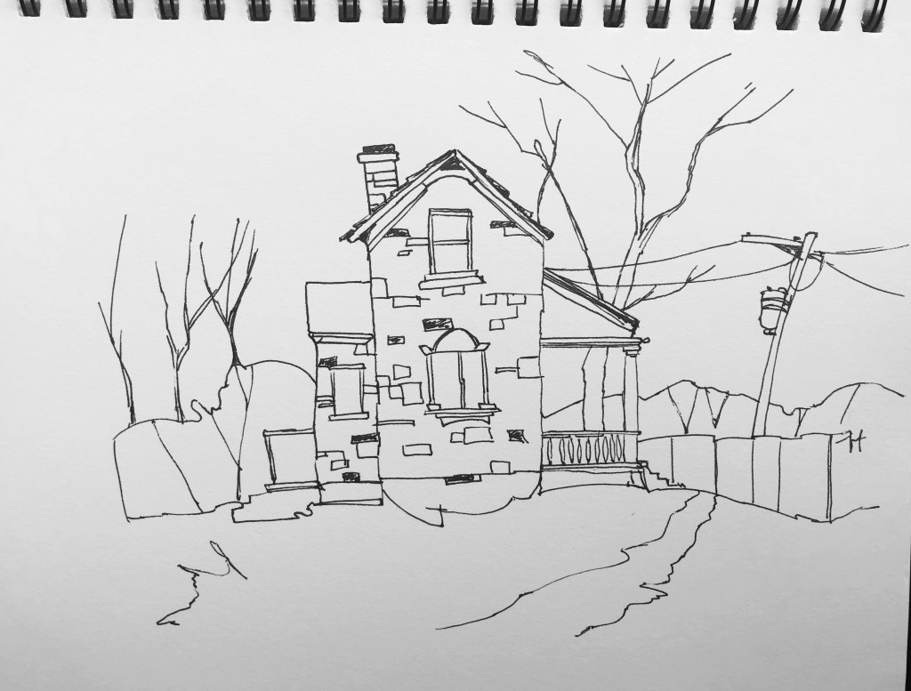
After the last image, I agreed to leave this drawing how it is and not add colour. A black and white image is just another variety of things I have tried.
I continued adding colour to this image, adding different shades and colours but it was hard to fix, I still disliked the colour choice. I could re do this image, maybe trace it onto more paper and try again. Time is against me however so perhaps I will leave this because I have other similar illustrations that worked much better.
With having Google’s Art and Culture app on my phone already and using it every now and then, I thought about blogging what I’ve found recently…
First off I wanted to remind myself of the Spanish Culture that I may have already seen and also add to what I’ve seen already. This app allows you to have virtual tours of buildings, streets and inside art galleries.


And then I thought about my project and how I can use this to inspire ideas…
I had a look at some online exhibitions that I can view on the app. I looked at relating work so tourist illustrations, mainly from London.

https://artsandculture.google.com/story/BQUxhFxSZvHUag This link is for the Spanish attractions I was looking at.
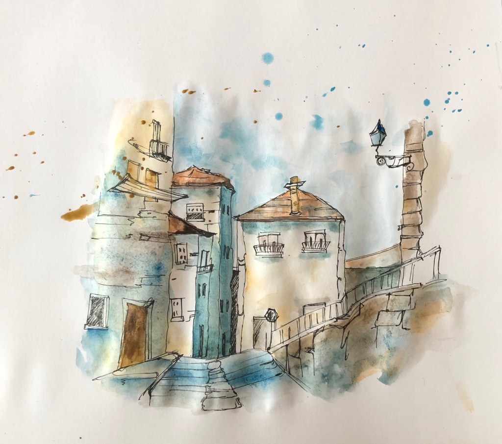
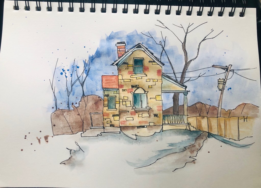
From tutor and peer feedback, both groups said I should make my drawing more detailed and related to my project. This was the response to my earlier watercolour illustrations . So as a response I have decided to spend more time drawing an illustration in the same loose style and watercolour technique and choosing a more Spanish city scene. And I loved the result!
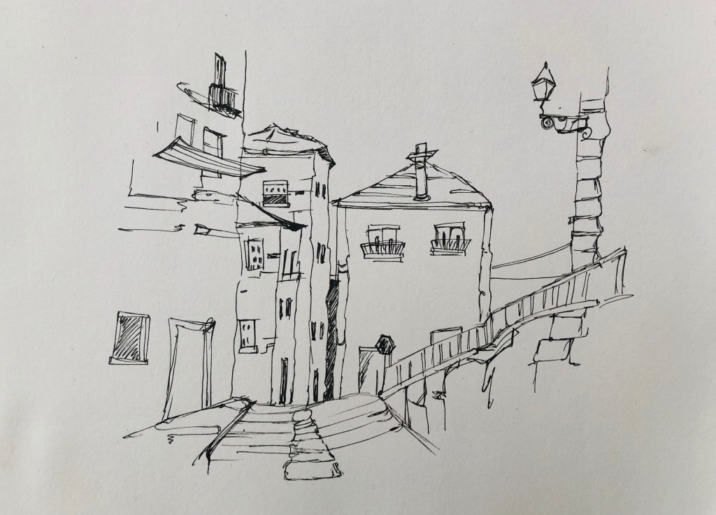
Today you will see I’ve decided to give drawing a go. Drawing some buildings, a pretty Spanish scene. I have just been using pencil, even though I want to be experimenting with other materials, I wanted to go back to the common media of pencil and master that first, starting from the very basic before I progress more.
I set out a few pencil shades ranging from HB to 4B and stuck to just these.

For getting the outlines I used a vanishing point on the horizon line and made sure it was applied to all my buildings.

For the shading I had to think about where the light was coming from which for this drawing it was from the right.

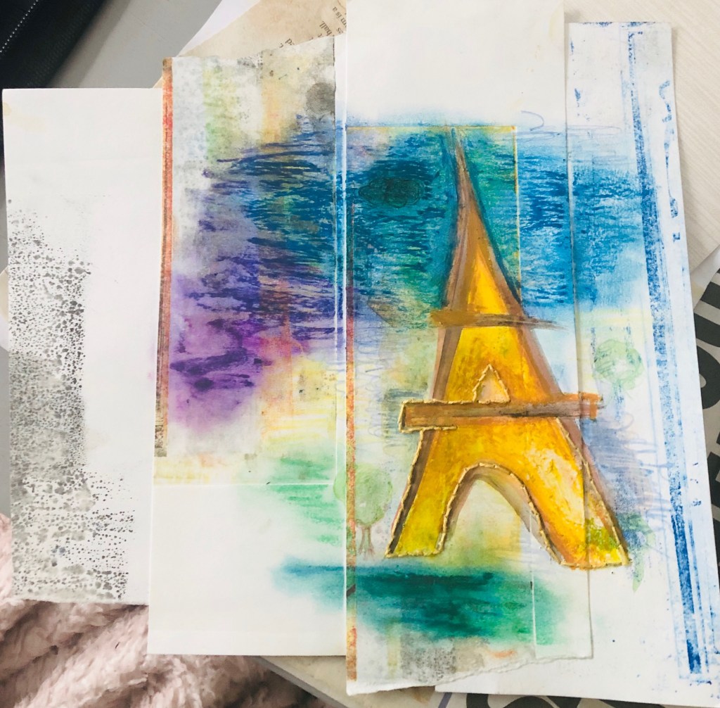

Media: Watercolour, oil pastel, coloured pencils, thread. Background: mixed off-cuts from coloured mono-prints put together.
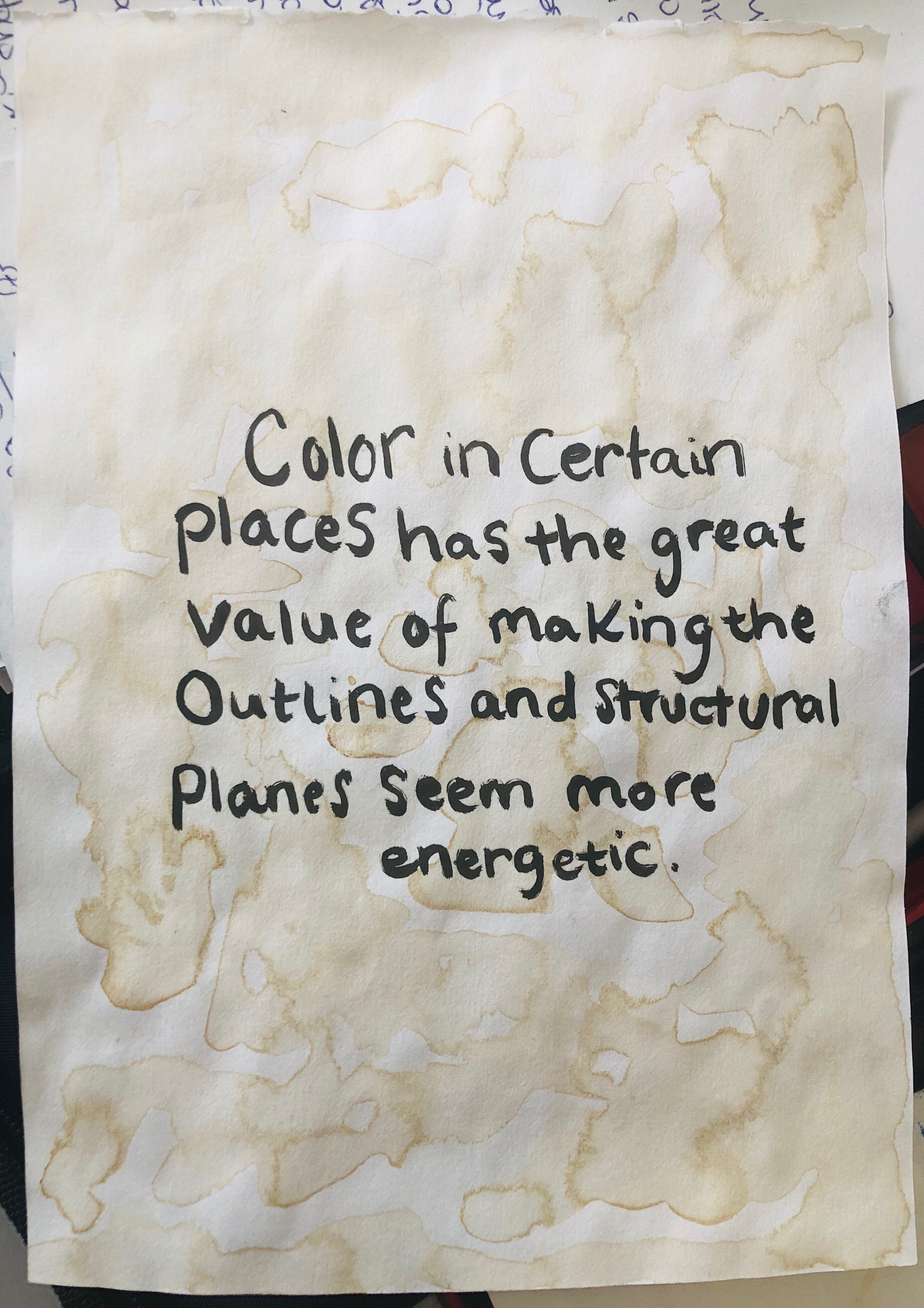
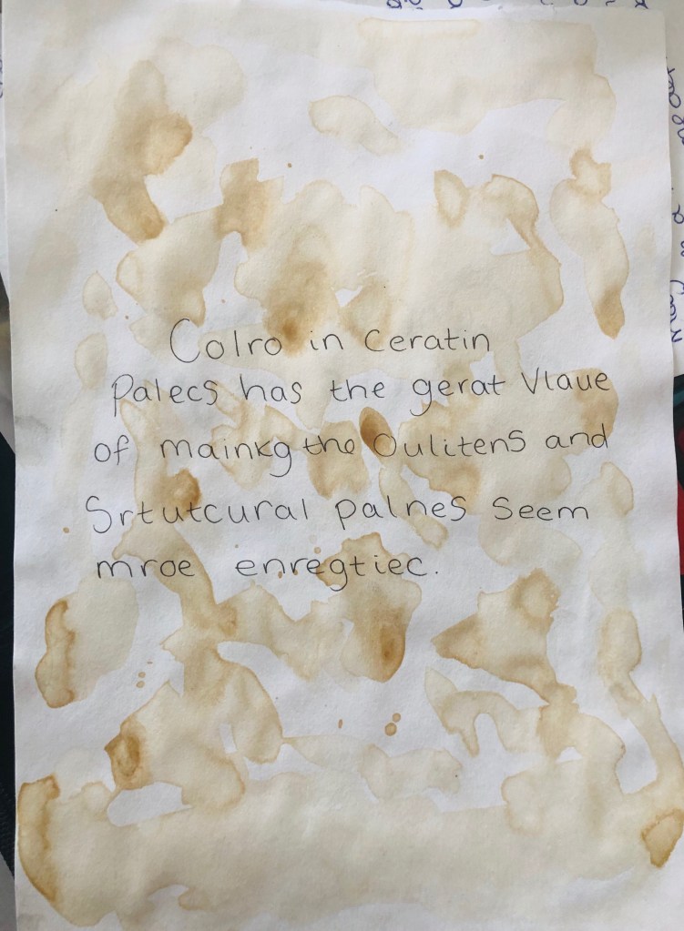
Here I have thought about what my tutor had said about text. I had taken a quote from Antoní Gaudí who I think is quite relevant in Spain’s urban appearance/attraction. The background on these is tea; I dipped my paintbrush in a cup of tea by accident and thought I’d carry on. Happy accident😀. Anyway, I thought I’d do my research on text and I found out that if it doesn’t matter what order the letters are that as-long as the first and last letters are still in place, you can still read it. I wanted to explore this so I tried it myself with the same Gaudí quote and tested it on my family members and they all successfully read it. I did make a mistake in the first word though as I mixed the last letter in the middle of the word, but luckily its still readable and quite unnoticeable.
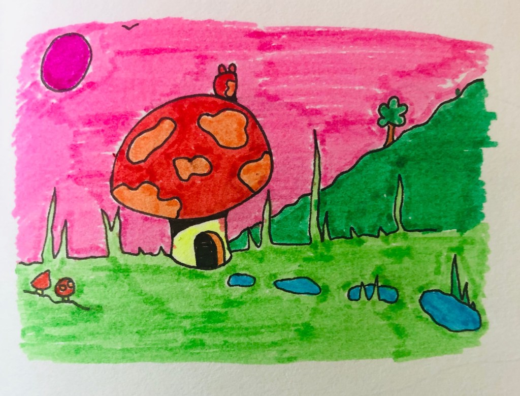
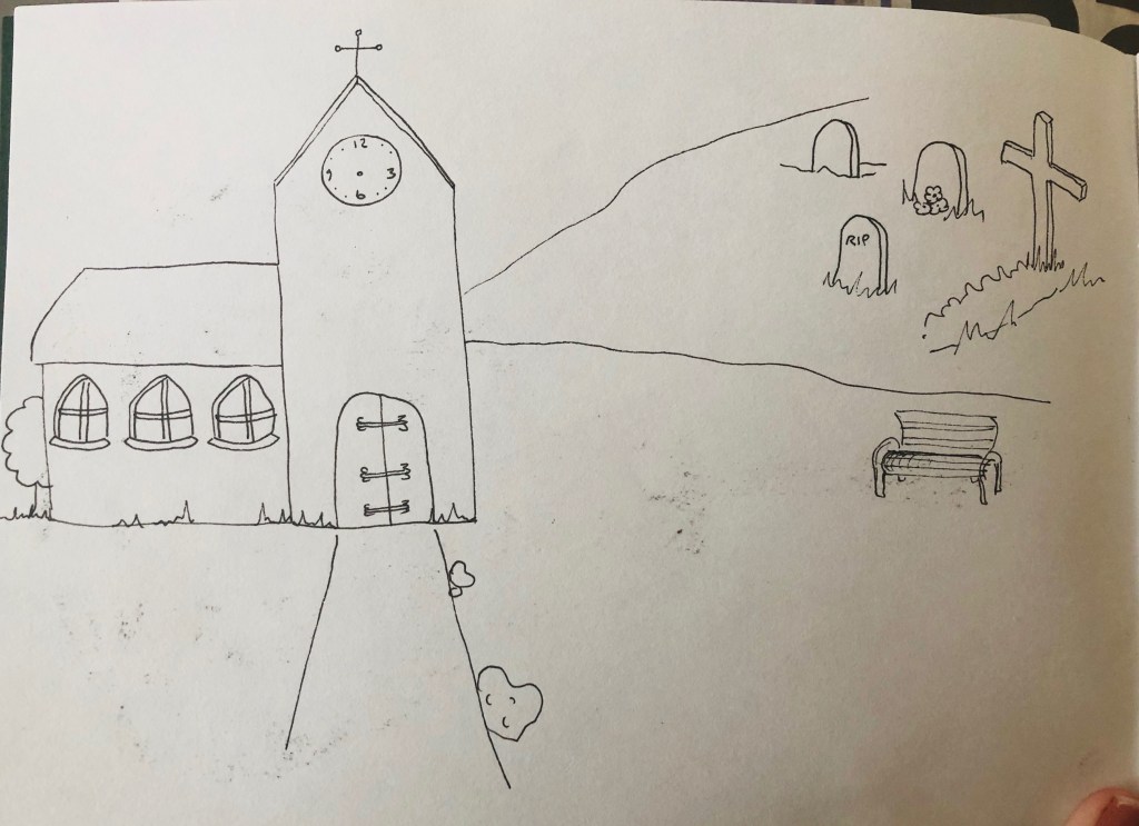


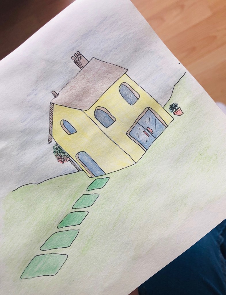
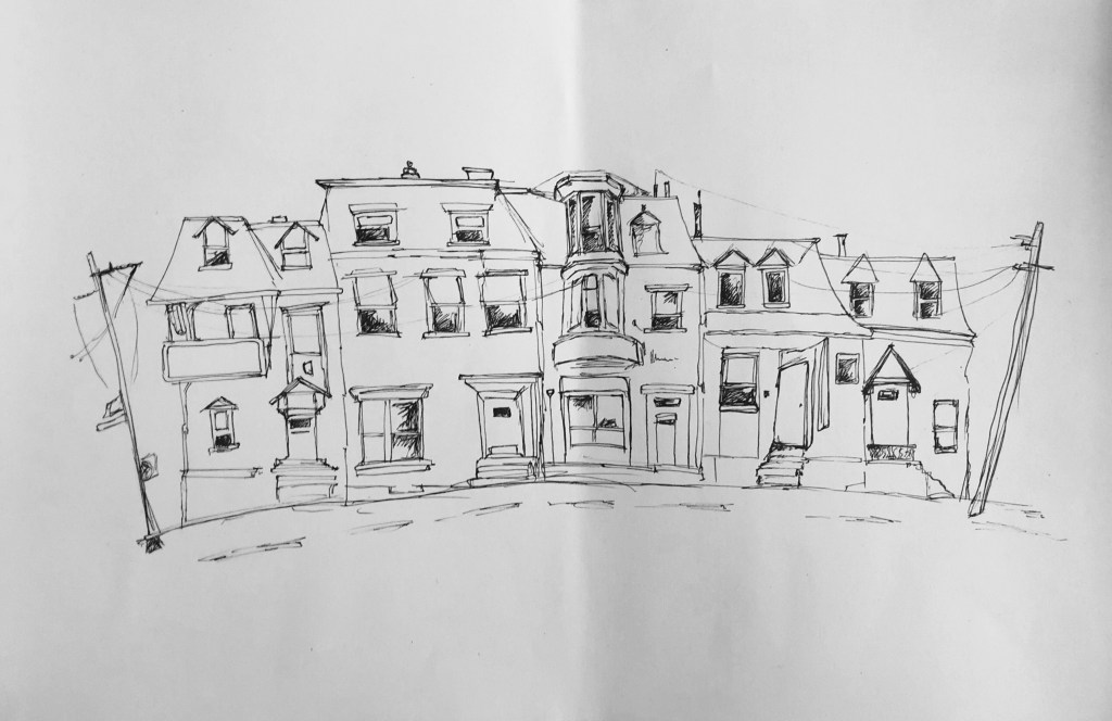
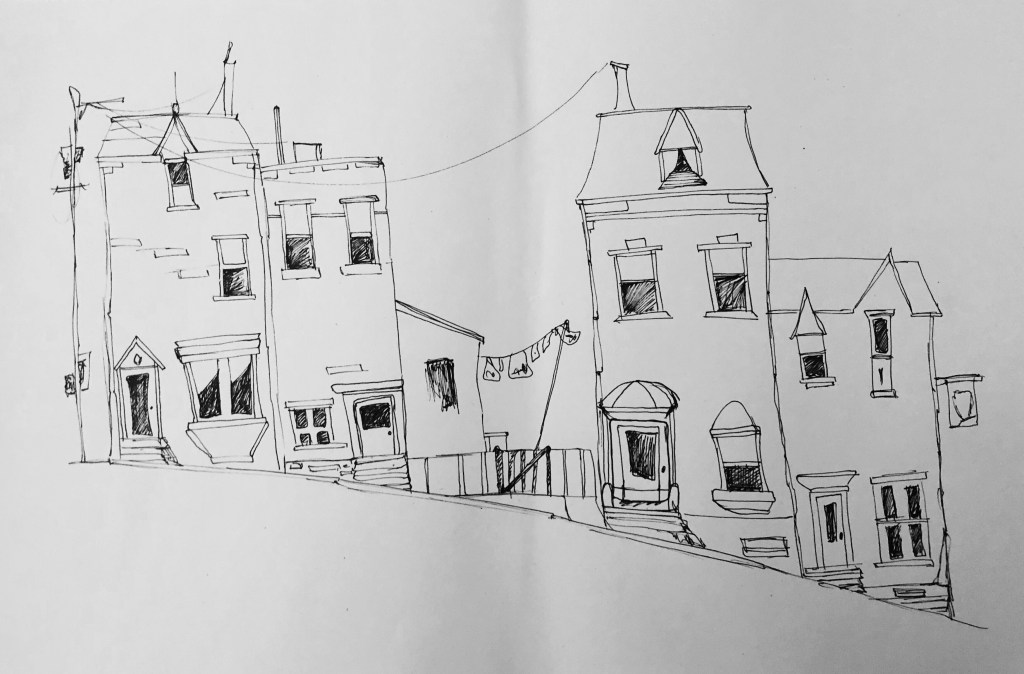
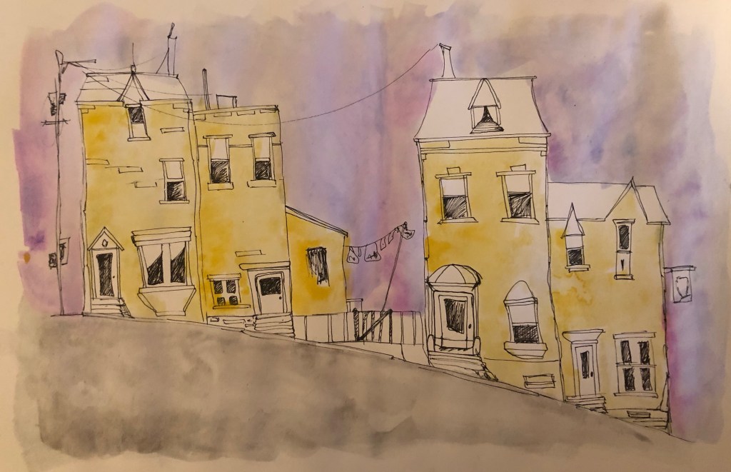
These are just basic drawings I’ve been doing in fine liner. Very simple, basic illustrations and adding colour in different medias for each one. These drawings are quite cartoon looking which is a different style to what I’ve done already. Im just trying at the moment, seeing how things look.
I dont really think the watercolour goes with the basic drawing style here, watercolour is more loose or made to blend which is a big juxtaposition to the cartoon look which is usually neat and solid, bright colours.
