
Video Tutorial Feedback
Foundation Art & Design


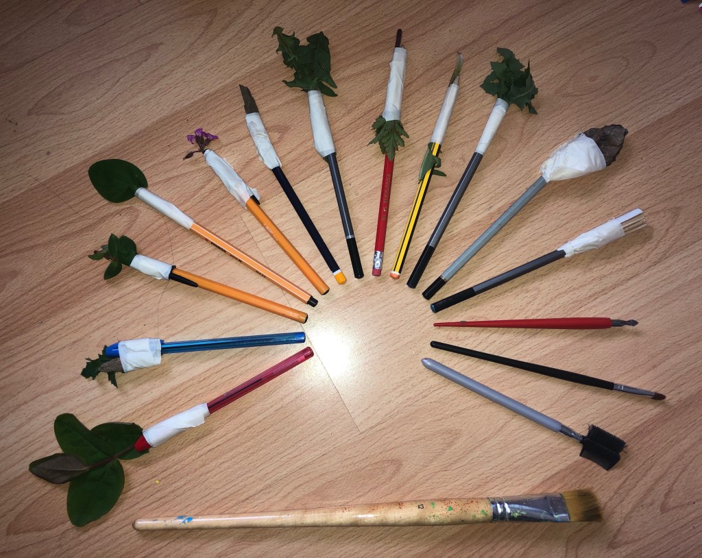
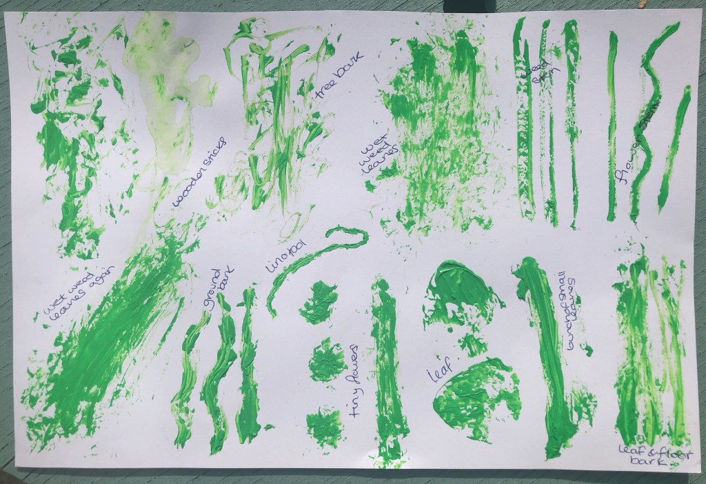
So while I was doing the small 2 minute experiments where I split the page into squares and using different techniques and medias, one technique I could have done is attaching something to the end of a pencil like a stick. But as I didn’t have enough squares on my page, I wasn’t able to do that so I was thinking of doing it on a separate page, but whilst I was thinking of what to attach to the pencil, I had lots of ideas and didn’t know which ones to choose. The result was just collecting whatever I found in my garden and using them all to see what the results would be.
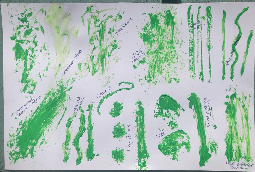

So I decided to use the same green acrylic paint for all of them and see what each one looked like when drawing a straight or wiggly line. I actually found it very difficult to paint with because unlike a paint brush, the paint didn’t get into all the little gaps, it was mainly just on the solid surface ad as soon as it touched the paper it just wiped off in the first second. Now I know why we use paint brushes and sponges to paint with instead of sticks and other solid tools.
The result was going to be me choosing one or two of the best and doing a piece of artwork with them but I have worked out that this will be very time consuming and it doesn’t relate to my project enough for me to do that so I’ve left this. But, I had to try it to learn 🙂
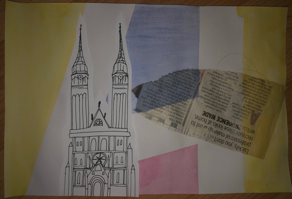
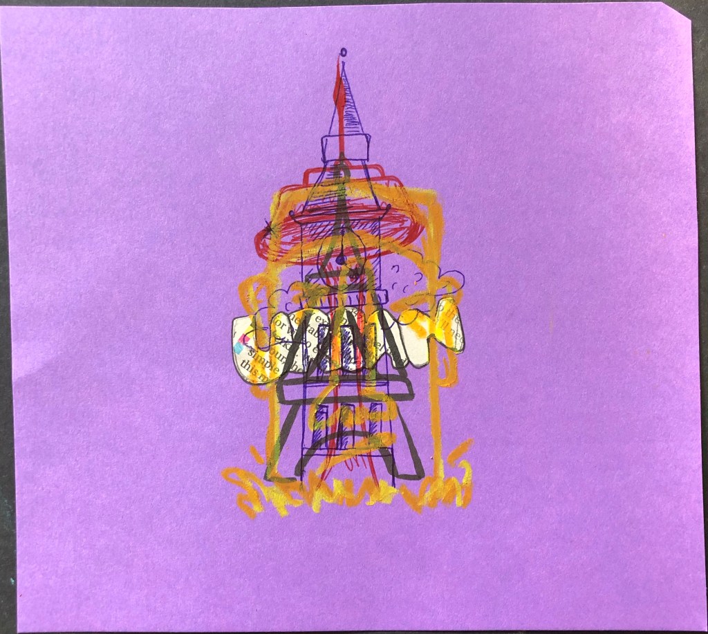
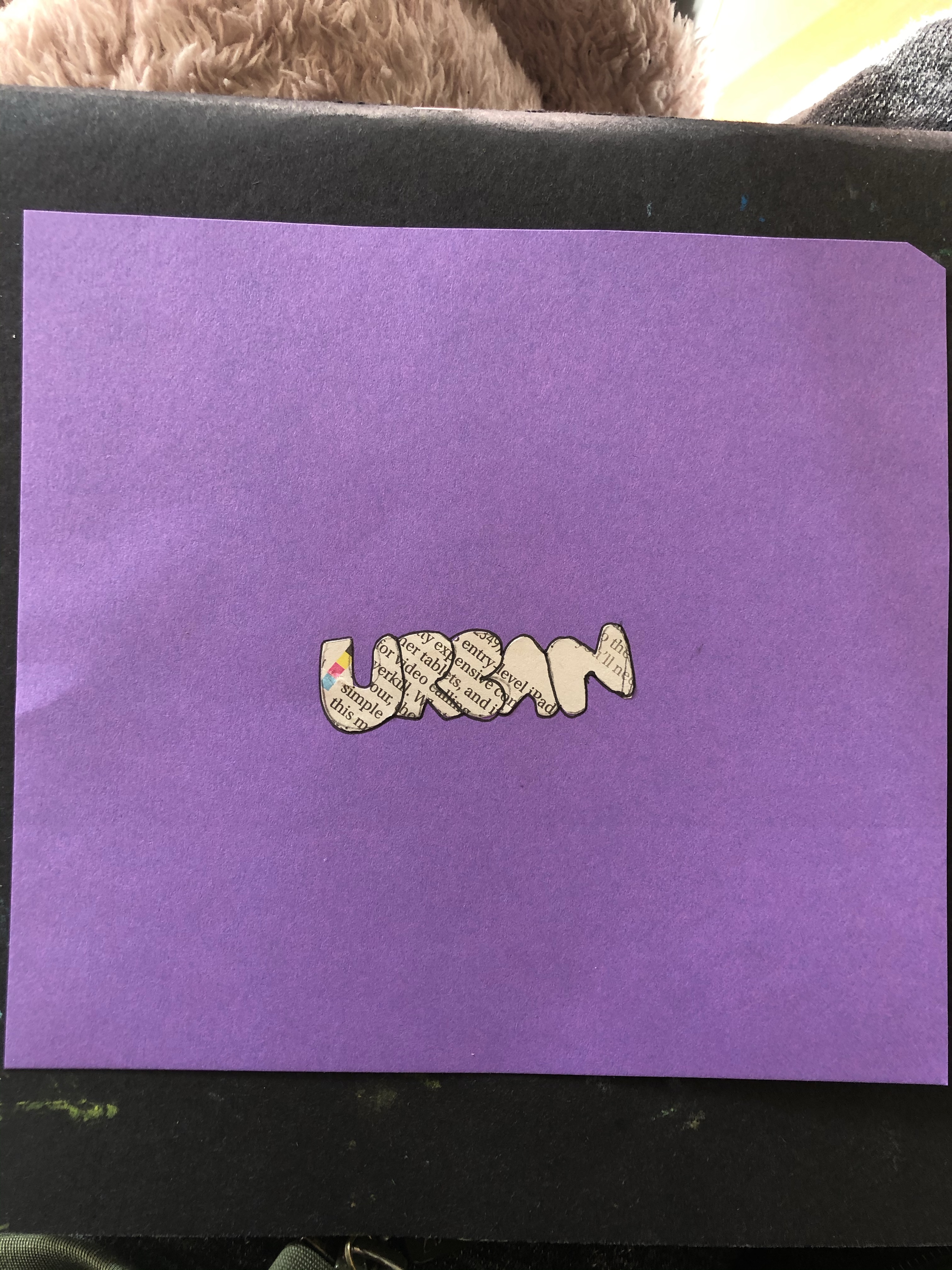
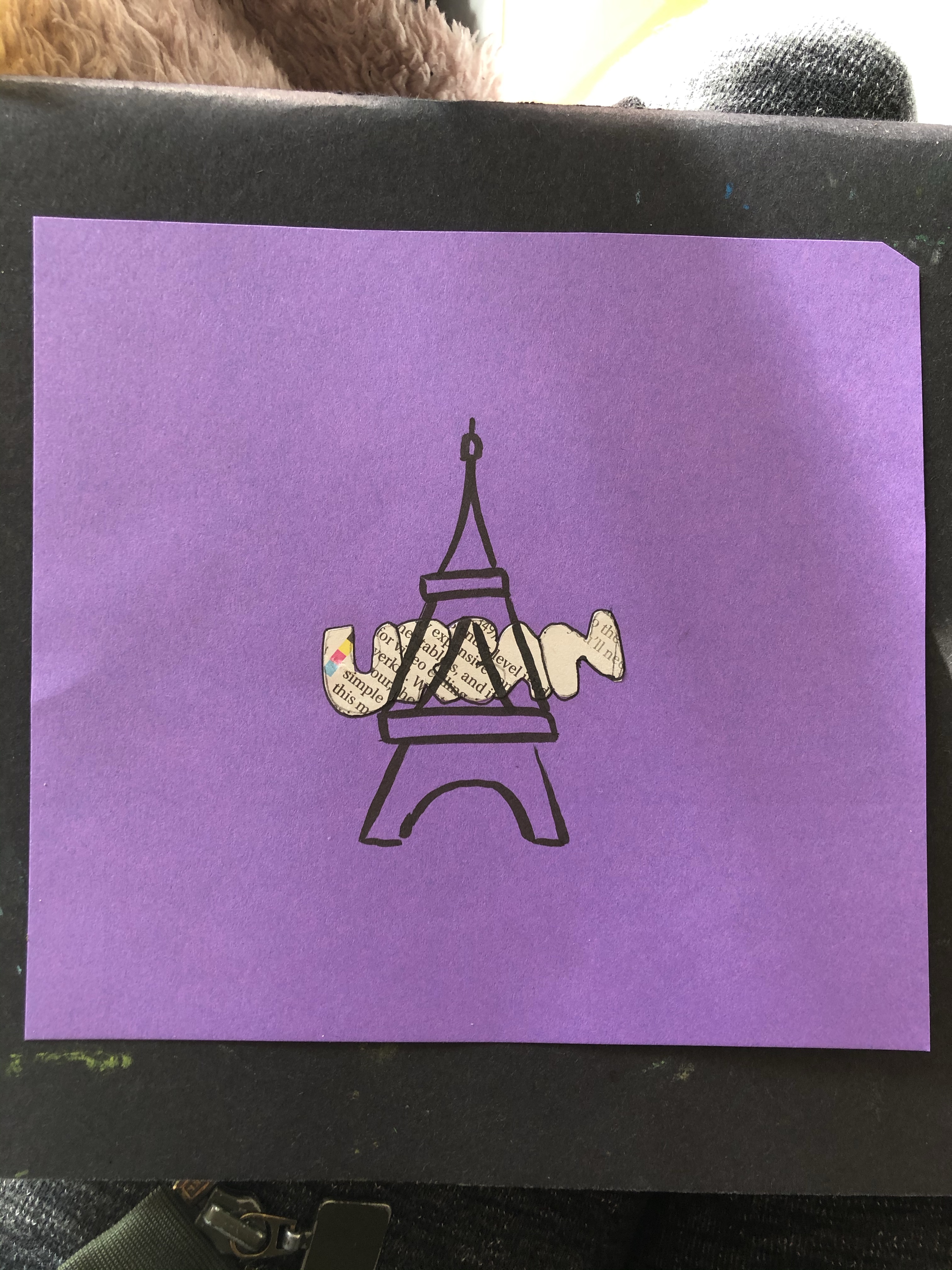
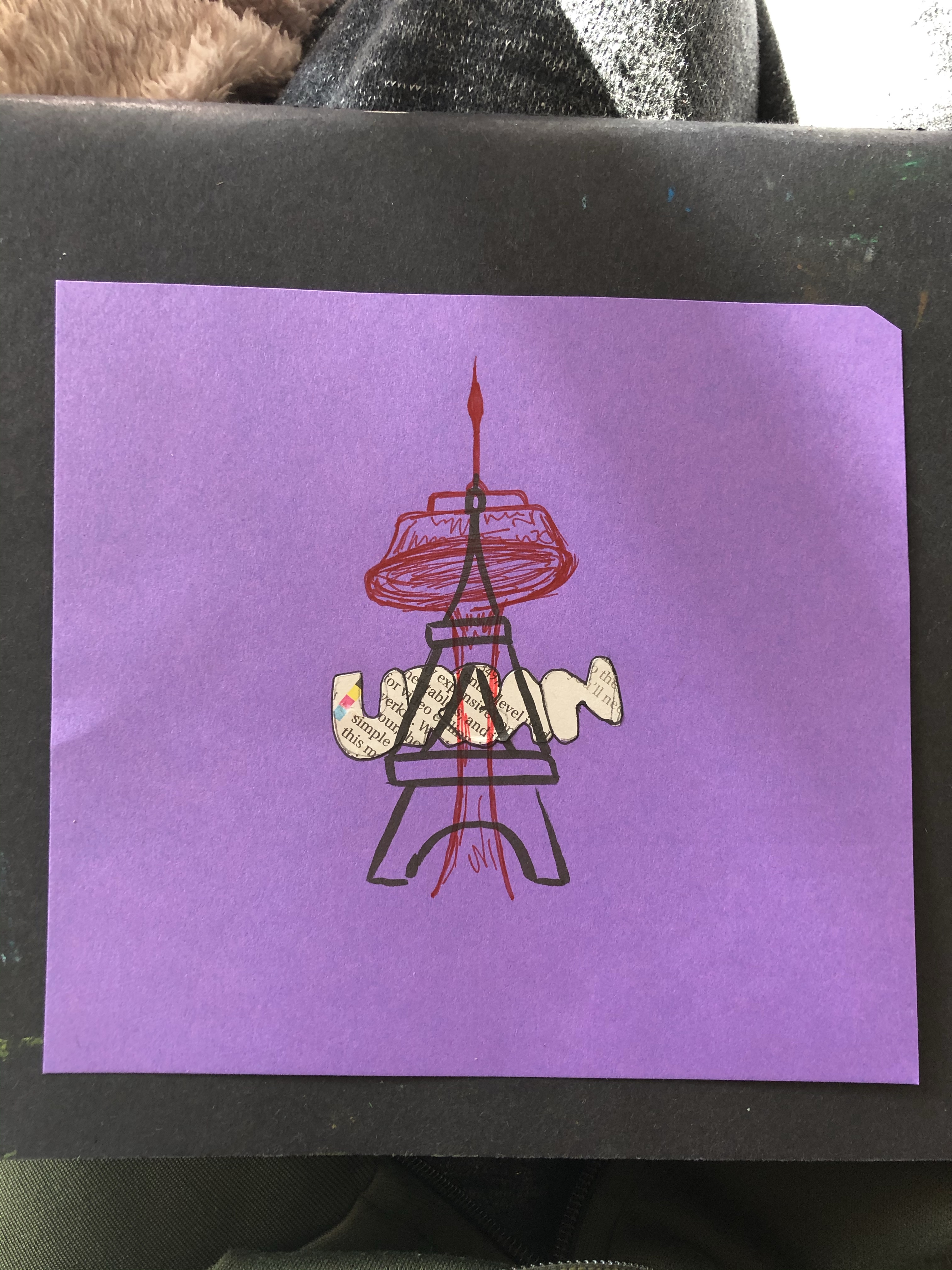
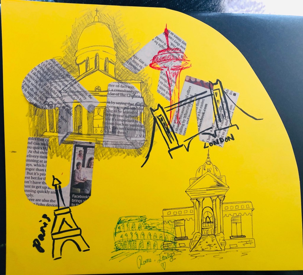
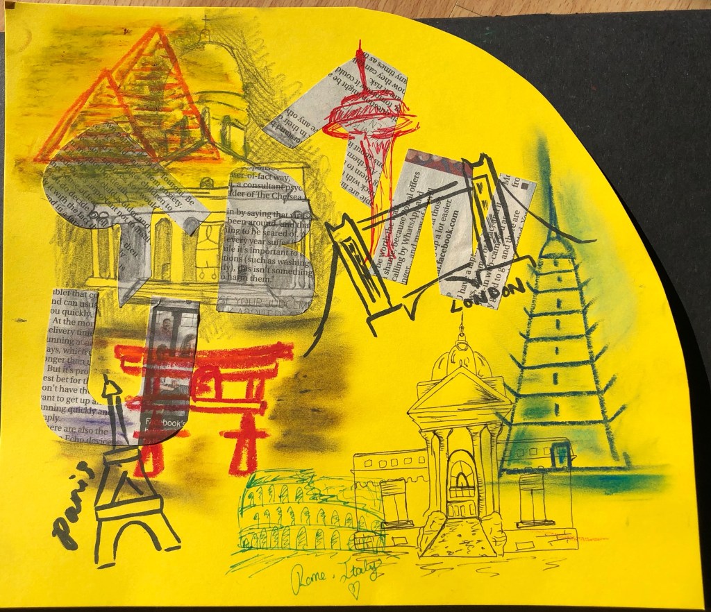
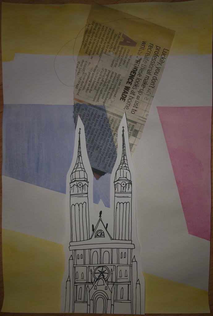
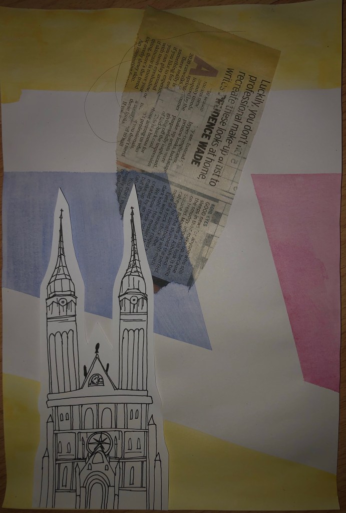
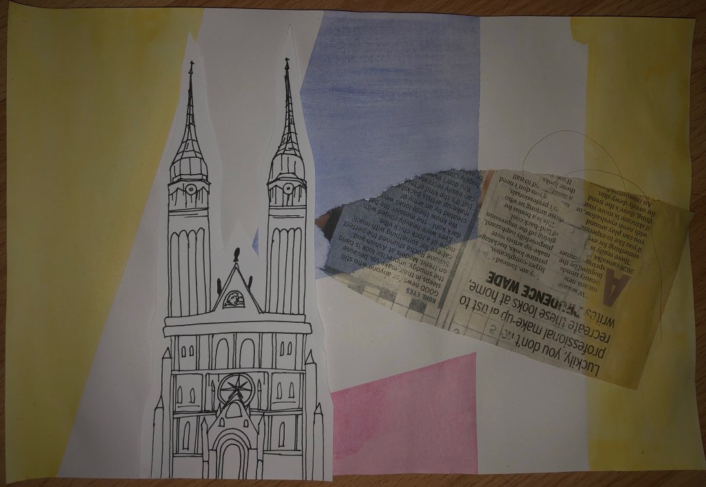
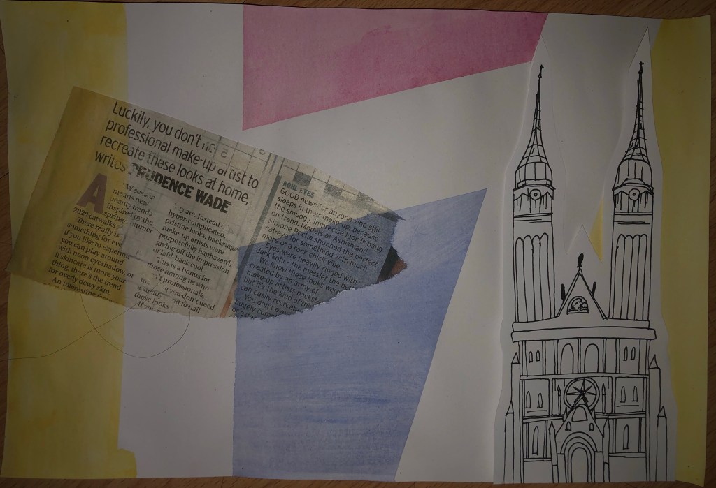
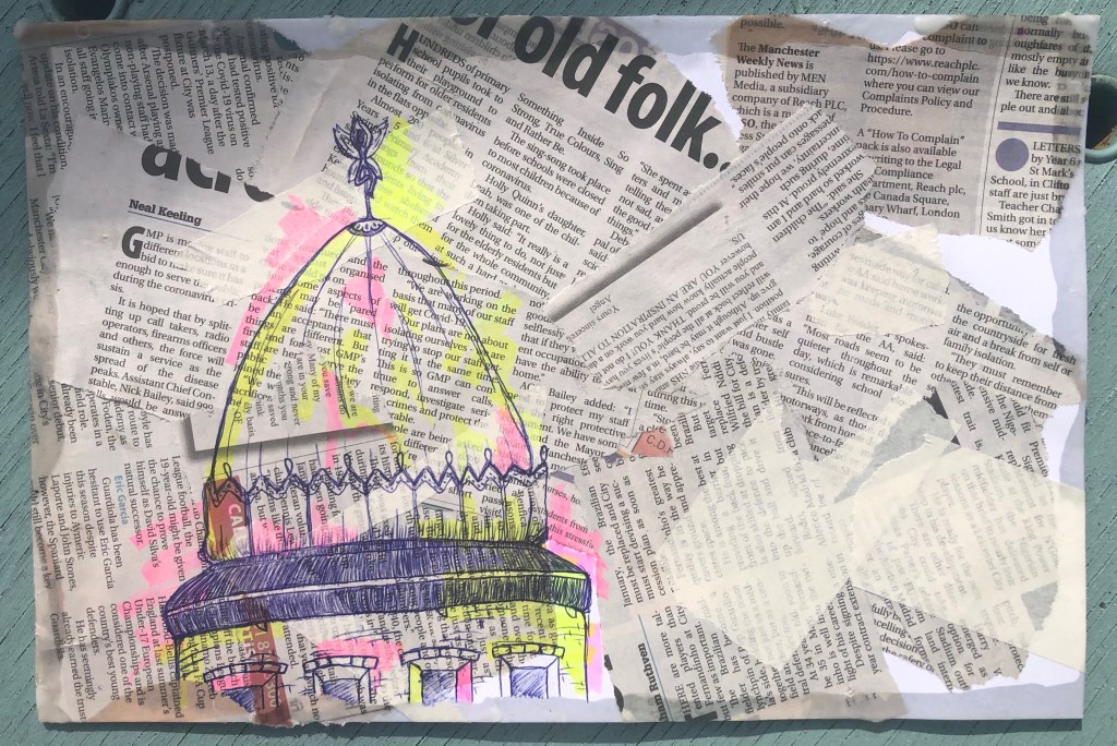
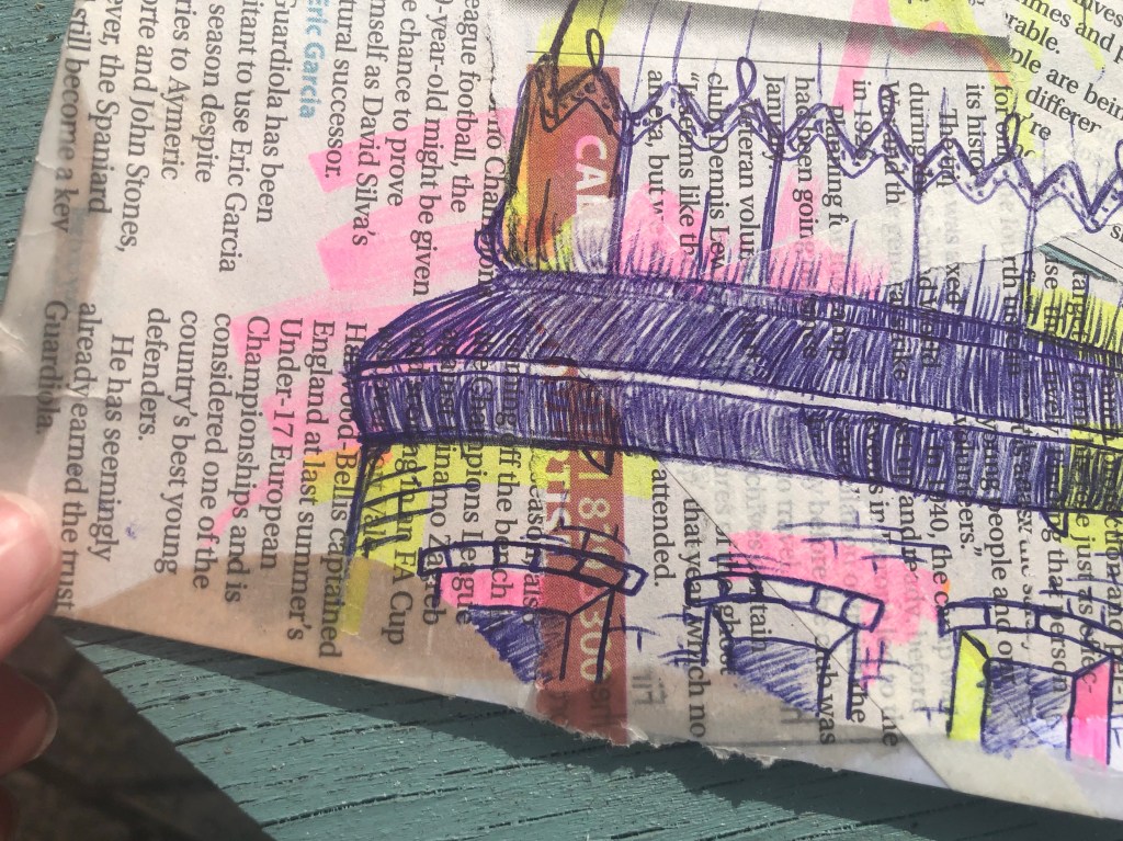
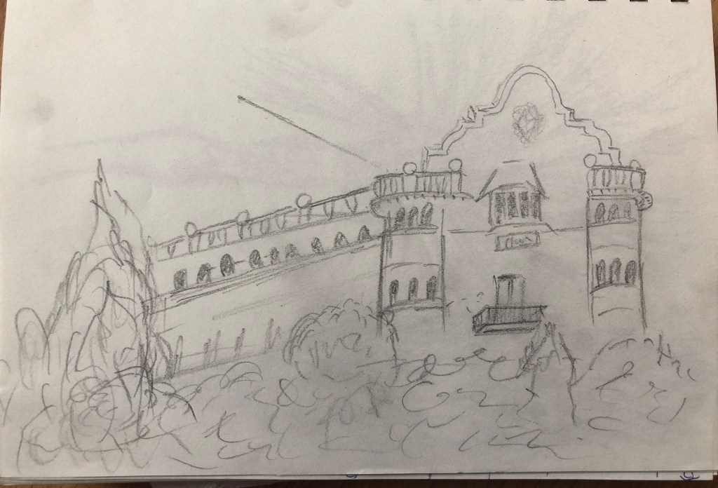
For this I drew the illustration of the cathedral on white paper with a black fine-liner and then cut around it leaving a border. I chosen this background I made with a bit of collaged newspaper and watercolour shapes in pastel colours that look very abstract, and I played around with positioning before permanently placing it.
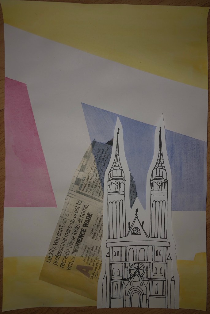
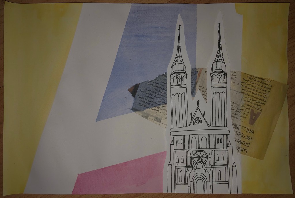
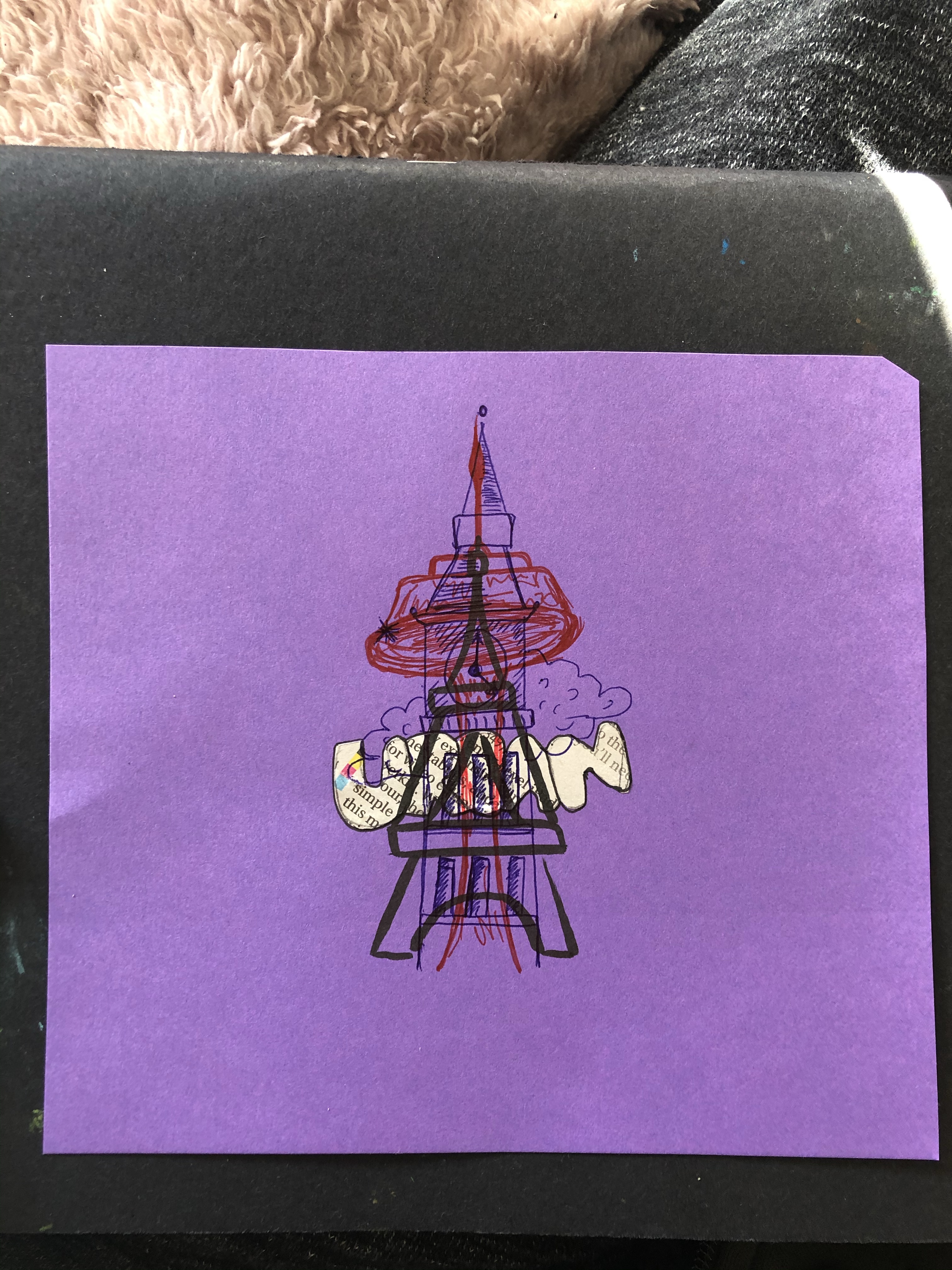
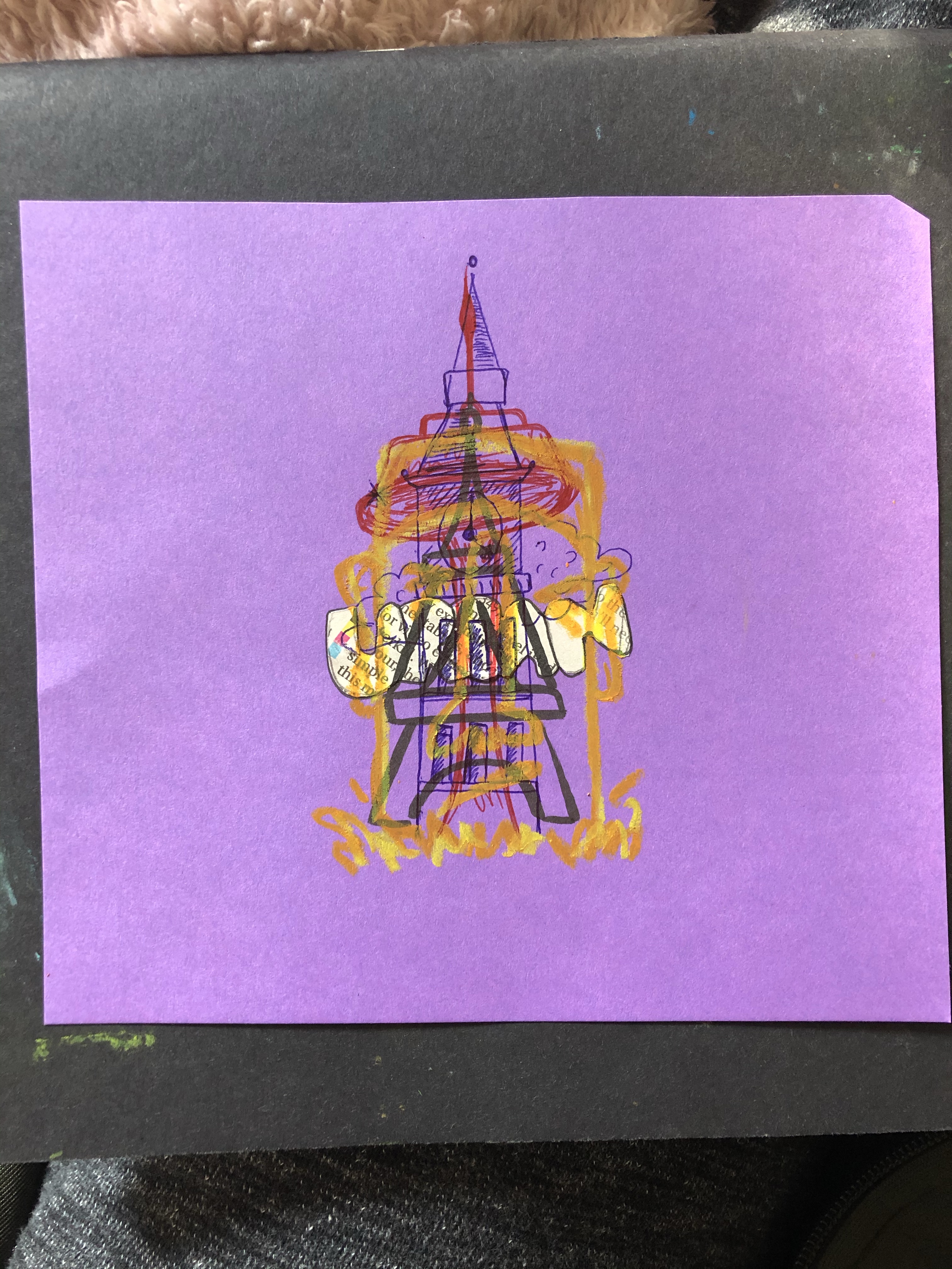
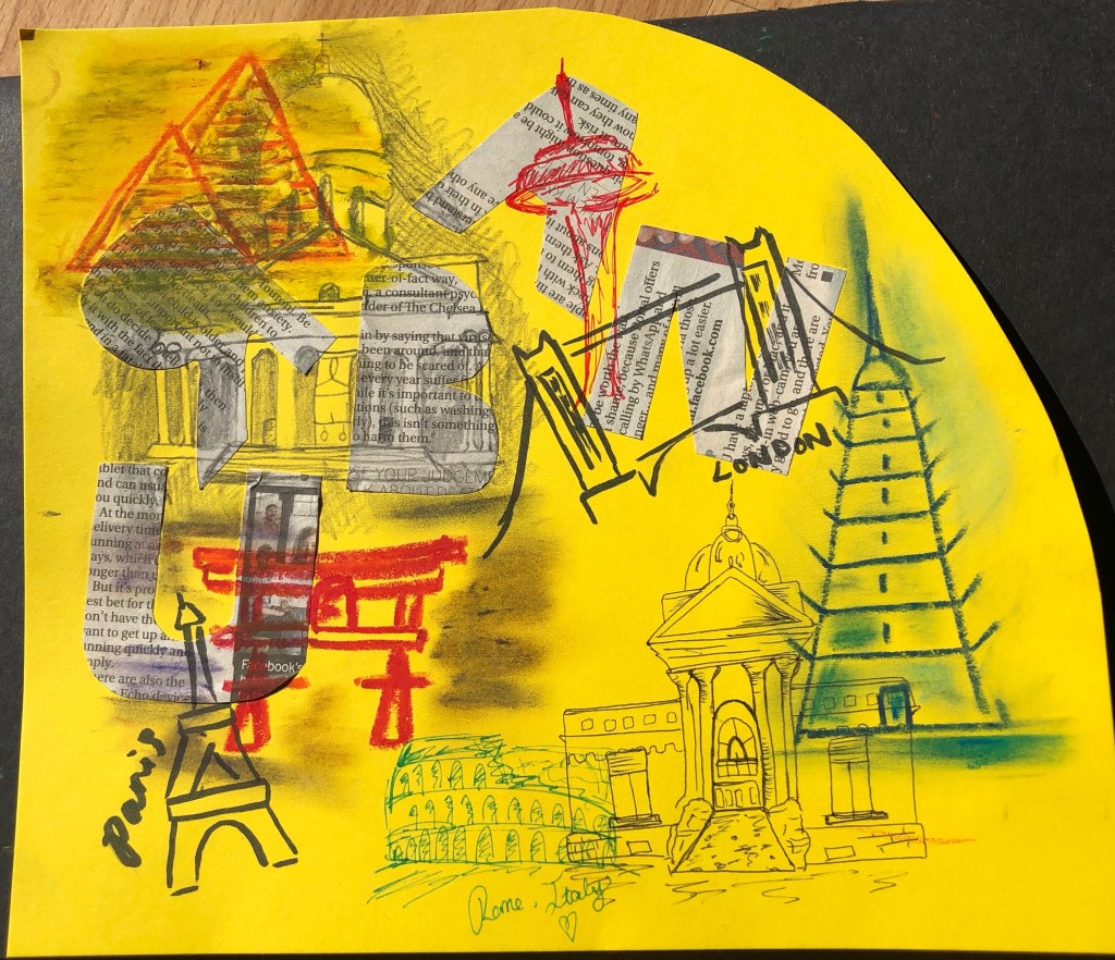
I was thinking of maybe creating another piece like this but adding more buildings of famous landmarks in cities and then maybe doing it again but with colour in the illustrations, maybe pen or oil pastels??
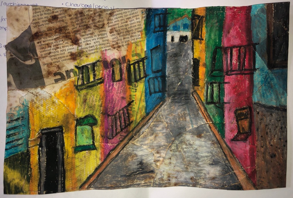
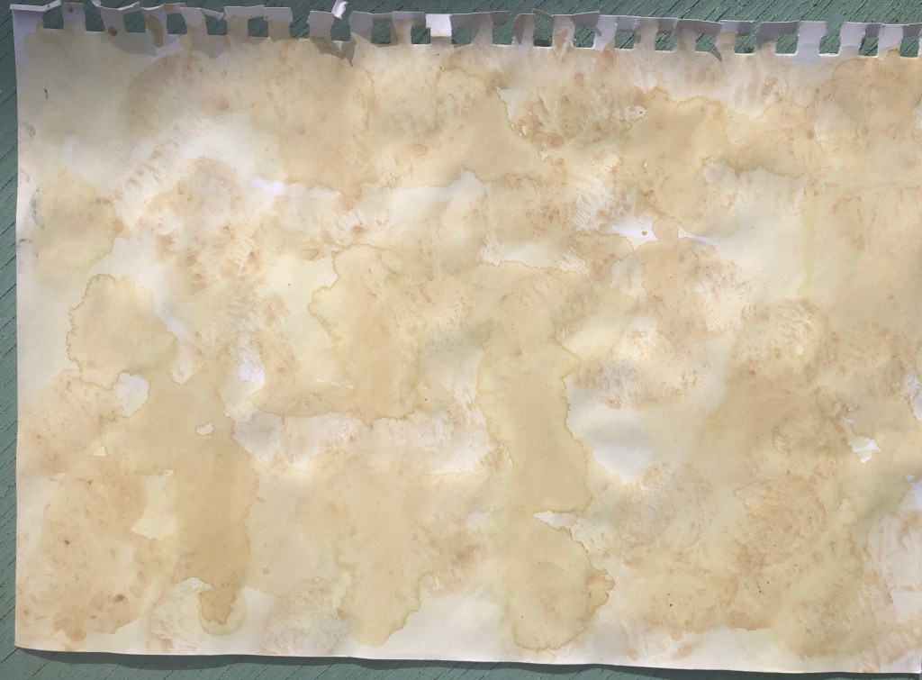
Since I liked the oil pastel quite a lot especially on the collaged surface, I decided to try the pastels again on a darker more textured surface. I drew a Spanish street in quite an abstract style. (I prefer abstract and illustration over still life and accuracy.) I do actually like this. I like how the colours look together. The only issue would be that you cannot really see the background through the pastel easily, its blocked it out a lot, especially the coffee stains i used for it so i trued to leave light marks in sone areas. This is also the reason to the drawing fading out in the top left corner because i wanted the background to have some attention abs be made aware if in this image.

A problem with this surface was that because it went so dry and crispy it became delicate because the bits of newspaper and envelopes was trying to fall off. The page couldn’t be bent or folded at all. I think this was because of the cleaning product I used on it and maybe it sort of deteriorated the paper or the glue. To try and solve this issue I had to re-stick the paper bits back to the paper with glue and press it down firmly to try and make it stay; it was still delicate but at least it was safe to work on with pastels.
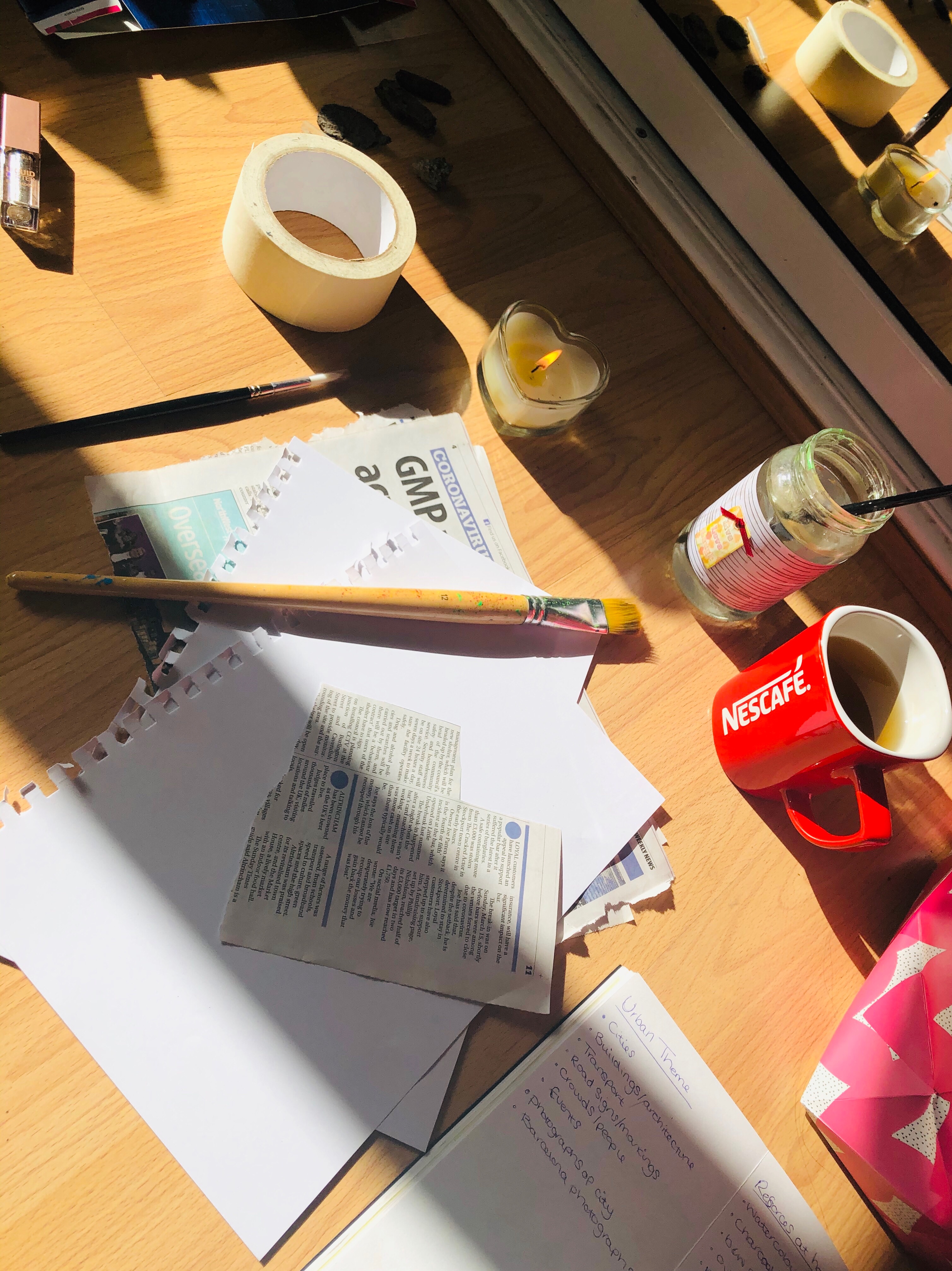
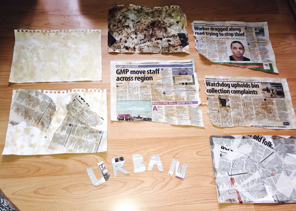
Experimentation on the pre-made collaged and tea ‘n’ coffee surfaces …
I’ve decided I want to do some experimental samples with different media and materials. To start off with I have collected a range of different services/backgrounds for me to work on and wait. I have experimented with a range of different materials and techniques to get these…


I have then started observational drawings. I was to look at people, objects,views through windows, Gardens, interior spaces. I was also to look at different media materials and styles such as colour, monochromatic, quick drawing, continuous line drawing and time limits etc. I wanted to try and get outside and create a body of drawings, this is fully experimental. I have also been suggested artists/artworks to look at which I am planning to do soon.


I then thought about experimental samples using different media and different techniques that will take me out of my comfort zone. To add more challenge I timed myself between 1 and 2 minutes for each sample. I enjoy doing this actually…


There is more Drawings to come…
As part of my ideas generation, I am going to create a mood-board.
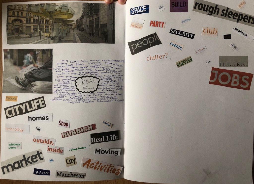
I am going to create a second mood-board for my ideas for this project. However it is very difficult to get images and materials for this as i am in quarantine and do not have access to a printer.
