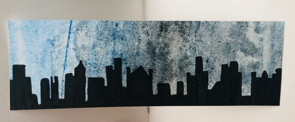
I have bought two booklets of visual textured paper that I want to use a bit. I dont like this piece because of the colours and shape, but really I was just layering again with media.
Foundation Art & Design
I have bought two booklets of visual textured paper that I want to use a bit. I dont like this piece because of the colours and shape, but really I was just layering again with media.
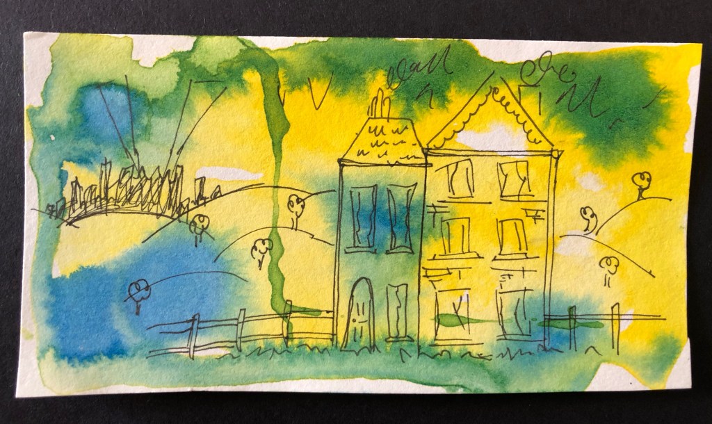
So today I have decided to give mono-printing a go without using ink. It had a really good result actually. I used newspaper to experiment with at first to see what works and where I can improve before using white paper and other materials. I picked out a few colours out of a big selection of wax crayons and randomly coloured in patches on the newspaper making sure I dont leave any gaps and that the crayon was on thick enough to imprint easier and consistent.
I put the newspaper over the coloured card I chose to print on, crayon faced down. And so on the reverse side of the crayon newspaper, I drew with biro; biro so I could see where I’ve drawn already, and applying a bit of pressure to be sure it prints well.

And then I did some smaller illustrations using the same technique. For each little drawing I did a fresh patch of colour on a new part of the newspaper.

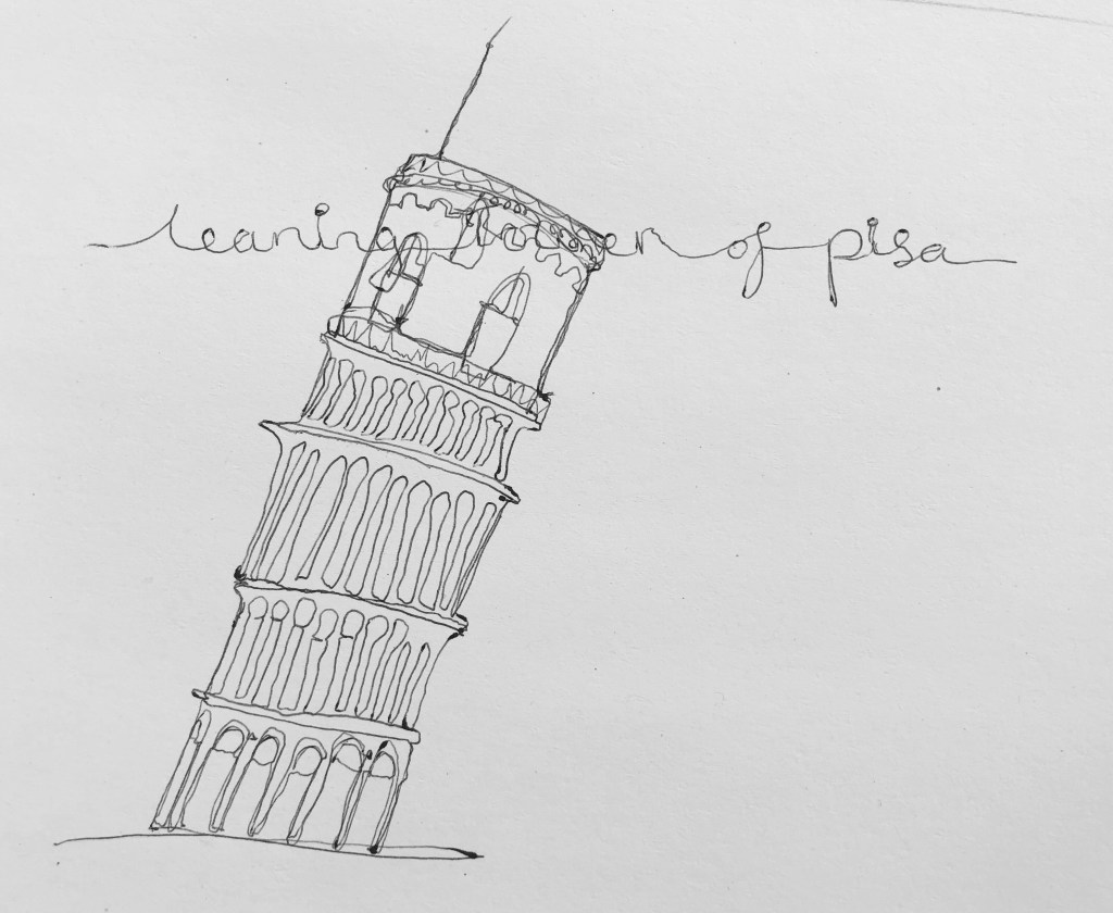


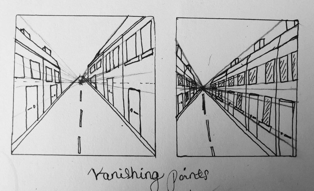
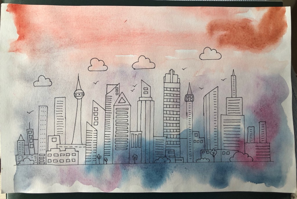
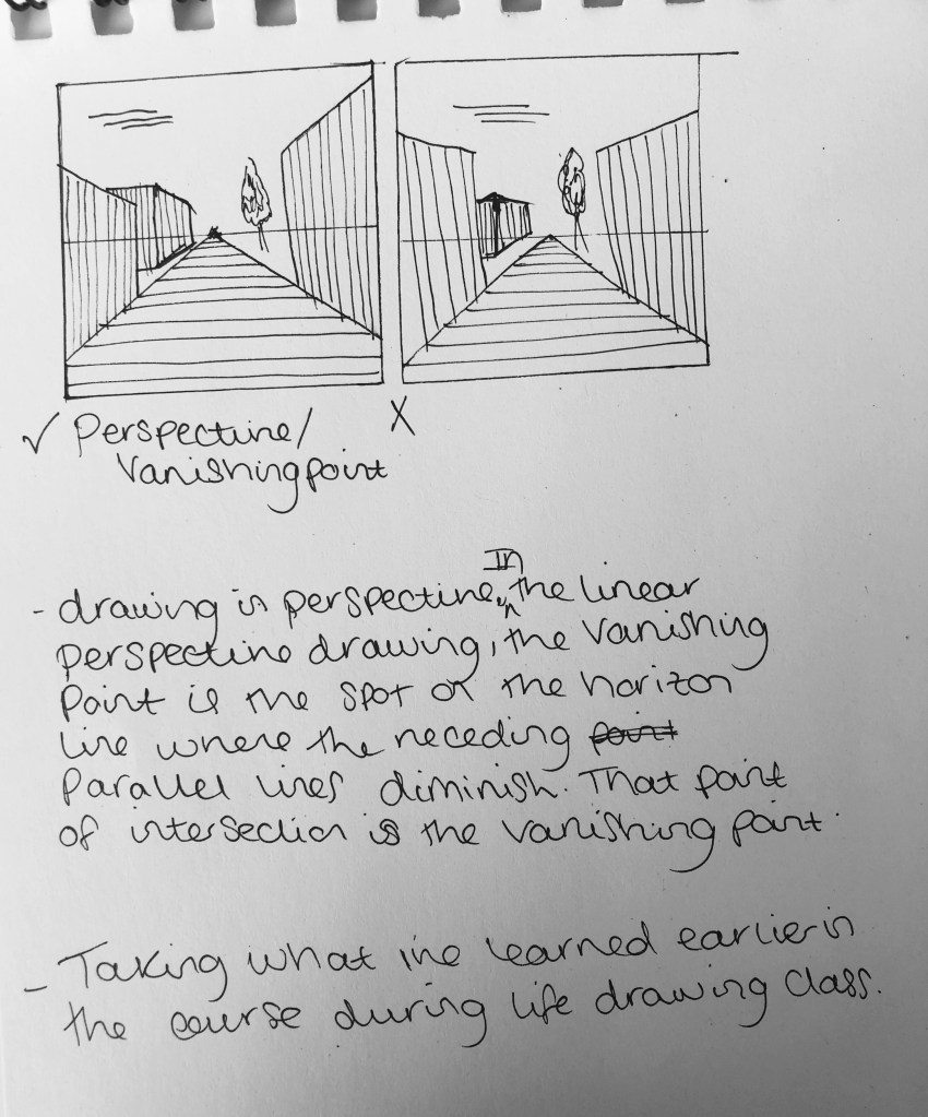
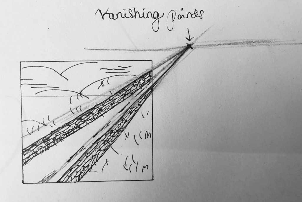
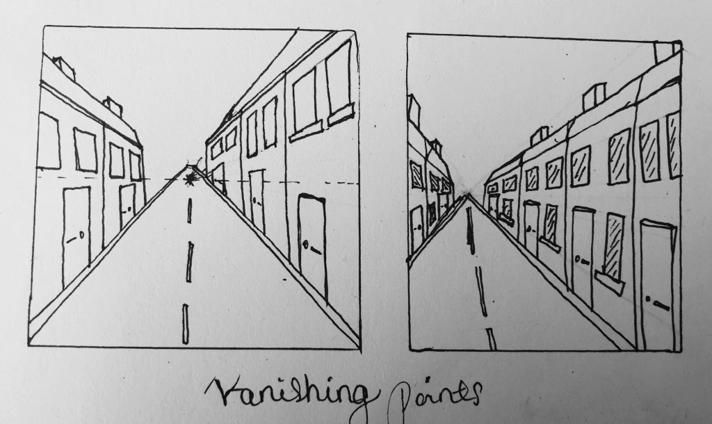
Vanishing point means to draw in perspective. In the linear perspective drawing, the vanishing point is the spa on the horizon line where the receding parallel lines diminish. The point of intersection is the vanishing point.
I am taking what I’ve learned earlier in the car story my life drawing class and using it to help me in this project. The vanishing points comes in handy when during cities and buildings and landscapes as I am doing in this project.

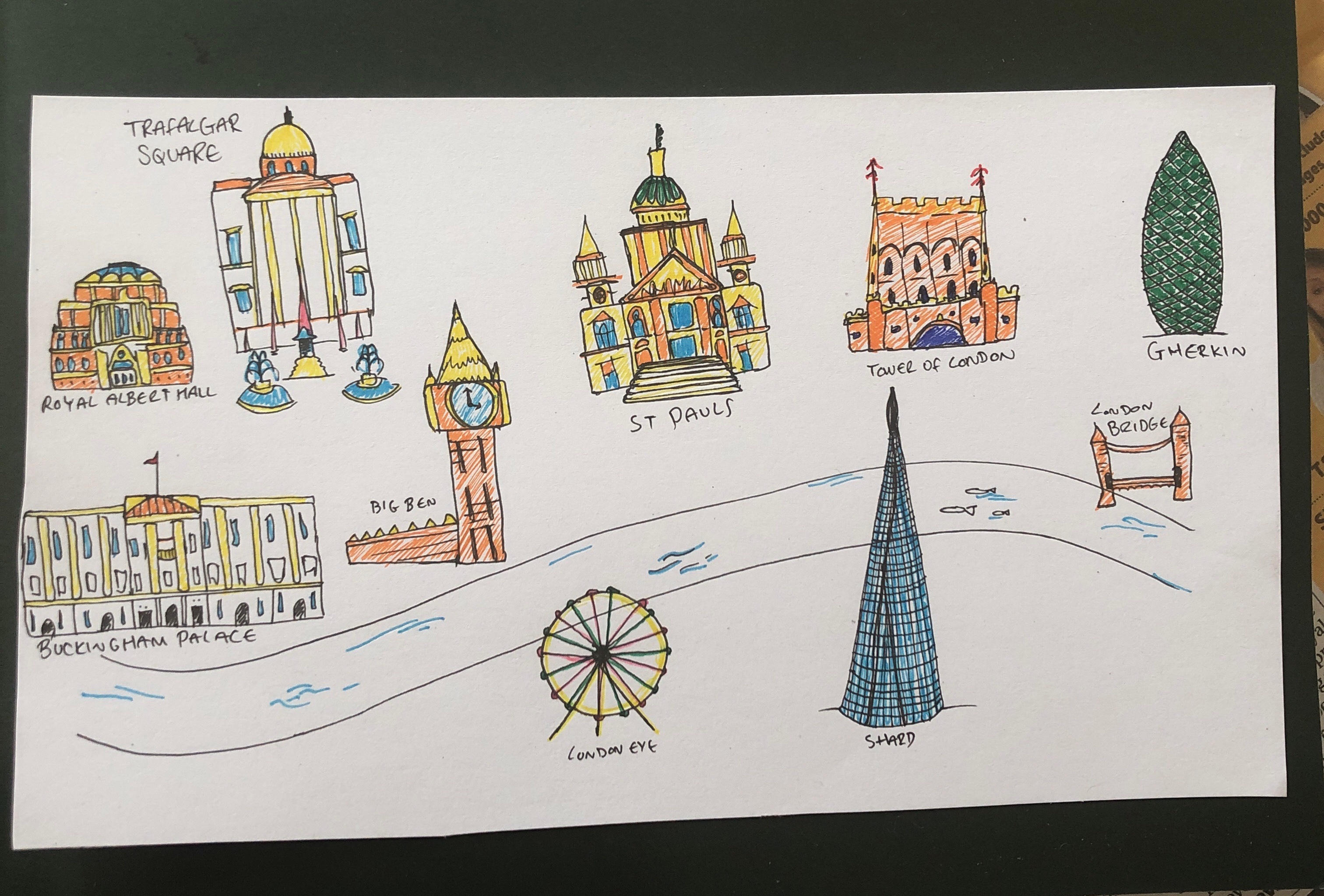
Before going straight into designing a tour guide I need to know about the different forms and see some real examples so I’ve took it upon myself to view some online leaflets and to also download some to have a look at.

I started with my own countries capital:London. I know london wuite well so it is a good first choice of research. This is the website I used — https://www.city-walks.info/London-en/Map.html — London tourist guides/maps This is a very detailed guide with detailed maps and information. It was very interesting.
The next thing I looked at was a London leaflet which was a pdf I downloaded. It was more basic and better to read I think. It had images and bullet points, like you’d want a leaflet to have. http://content.tfl.gov.uk/visitor-leaflet-welcome-to-london-nov16.pdf — One thinh i liked was the map and the little symbols it had. It would be good if they were little drawings (illustrations).

Since now I am halfway through the project, I think it is very important that I have some kind of structure. After all the research and experimentation so far, and after getting tutor feedback through video tutorials, I have been considering designing a leaflet or tourist guide for tourists of course travelling to a particular city like Spain. Or even one for Europe architecture and landmarks since I am doing this project about them?
Things I would have to consider is the type of book or guide I want to do, so the shape and form. I want minimal text as I need to focus on the art, and so maybe something that requires the very minimum amount like a map or leaflet. Target audience would match that a bit because if it’s one for parents then it should require a lot of text, whereas one for children, it could just be bright illustrations. I could even think about language skills so just illustrations would be appropriate for everyone of every language.
I would also need to consider the style of illustrations I chose. Detailed, loose, sketchy, graphic? Also the colour palette: pastel, bright, warm? And the media being used: paints, pastels, pens, pencils, ink? The overall aesthetics of the piece as a whole needs thinking about, with everything included so not just the illustrations but the positioning, colour, layout, size, shape, form etc…